


Serviços Personalizados
Journal
Artigo
 texto em
  Inglês (pdf)
 Artigo em XML
 Referências do artigo
 Enviar este artigo por email
Indicadores
-
 Citado por SciELO
 -
 Acessos
Links relacionados
-
 Similares em
SciELO
Similares em
SciELO
Compartilhar

 Permalink
Vista. Revista de Cultura Visual
versão On-line ISSN 2184-1284
Vista no.12 Braga dez. 2023 Epub 31-Dez-2023
https://doi.org/10.21814/vista.4867
Thematic Articles
The Coliseu do Porto in the Posters of Cruz Caldas. Fragments of an Imaginary City
1
, Conceptualisation, investigation, writing - original draft, writing - review & editing http://orcid.org/0000-0001-8477-617X
1
, Methodology, writing - original draft, writing - review & editinghttp://orcid.org/0000-0002-5533-4687
1 Centro de Estudos de Comunicação e Sociedade, Instituto de Ciências Sociais, Universidade do Minho, Braga, Portugal
O estudo preliminar que aqui se apresenta insere-se no âmbito de um trabalho de recolha, análise e divulgação que a Passeio (Plataforma de Arte e Cultura Urbana do Centro de Estudos de Comunicação e Sociedade/Universidade do Minho; https://www.passeio.pt) se encontra a desenvolver, relacionando memória, cultura visual (design gráfico e publicidade exterior) e espaço urbano. Para o caso específico deste artigo, selecionamos uma amostra de 39 objetos gráficos (maioritariamente, cartazes, mas onde também se incluem programas e ilustrações) que o publicitário António Cruz Caldas (1898-1975) elaborou para o Coliseu do Porto, entre 1941 e 1969. Propomos, a partir desse corpus, estimular uma discussão sobre a dimensão cultural da publicidade, reinterpretar o valor de memória do documento de arquivo, construir novas representações sobre a cidade imaginada inscrita nestes documentos e, finalmente, questionar qual o papel do cartaz hoje, numa era de hiperestimulação. A análise da amostra selecionada assenta na classificação sugerida por Abraham Moles (1969/1987), mais especificamente, nas características de “informação”, “sedução”, “educação”, “estética” e “criação”. Comparando os objetivos iniciais com a análise concretizada, podemos concluir que os cartazes criados por Cruz Caldas com um intuito originariamente de eficácia (publicitar os eventos culturais do Coliseu do Porto), condensam, simultaneamente, uma corrente estética (modernismo), uma praxis individual e uma representação, a um tempo, real e imaginária da vida cultural da urbe, espelhando, por esta via, a dimensão cultural da publicidade. Adicionalmente, ao trazermos para o olhar presente este conjunto documental, não só revelamos o valor dos seus aspetos formais e de conteúdo, como os transformamos em ferramentas de questionamento das práticas atuais. Fazendo-nos imergir no quotidiano da cidade representada por Caldas, o cartaz publicitário leva-nos a reconstruir e a ficcionar o espaço urbano. Por fim, é manifesta, nestes exemplares, a convergência de vários talentos artísticos (trabalho manual, domínio do desenho, influência da ilustração, noções geométricas de movimento e espacialidade), o que acentua o seu estatuto de obra de arte, impelindo-nos a refletir sobre a efemeridade do cartaz hoje e conjeturando o que será o registo da sua memória futura, dada a volatilidade dos suportes atuais.
Palavras-chave: António Cruz Caldas; cartaz publicitário; Coliseu do Porto; cultura urbana
The Coliseu do Porto in the Posters of Cruz Caldas. Fragments of an Imaginary City
The preliminary study outlined in this paper contributes to a broader project undertaken by Passeio (Platform for Urban Art and Culture of the Communication and Society Research Centre/University of Minho; https://www.passeio.pt), which connects memory, visual culture (graphic design and outdoor advertising) and urban space. For this particular work, we have selected a sample of 39 graphical objects (predominantly posters, but also programmes and illustrations) designed by the publicist António Cruz Caldas (1898-1975) for the Coliseu do Porto from 1941 to 1969. Based on this corpus, we propose to prompt a discussion on the cultural dimension of advertising, reinterpret the memory value of the archive document, create new representations of the imagined city encapsulated in these documents, and, ultimately, challenge the contemporary role of the poster in an era marked by hyperstimulation. The analysis of the selected sample draws upon the classification suggested by Abraham Moles (1969/1987), specifically focusing on "information", "seduction", "education", "aesthetics", and "creation". Comparing the initial objectives with the conducted analysis, we can conclude that the posters created by Cruz Caldas with an originally effective purpose (to promote the cultural events at the Coliseu do Porto) simultaneously condense an aesthetic current (modernism), an individual expression and a representation, at once real and imaginary, of the city's cultural life, thus mirroring the cultural dimension of advertising. Bringing these documents into the present unveils not just their formal and content-related value but also transforms them into instruments for questioning contemporary practices. By immersing us in the city's daily life as depicted by Caldas, the advertising poster prompts us to reconstruct and fictionalise the urban space. Moreover, these examples demonstrate a convergence of diverse artistic talents (showcasing manual skills, adeptness in drawing, influences from illustration, and geometric concepts of movement and spatiality). This amalgamation emphasises their status as works of art, prompting contemplation on the transient nature of the poster today and sparking speculation about how their memory will endure in the future amid the volatility of current media.
Keywords: António Cruz Caldas; advertising poster; Coliseu do Porto; urban culture
1. Introduction
The current research is part of a broader field project undertaken by Passeio (Platform for Urban Art and Culture of the Communication and Society Research Centre/University of Minho) aimed at collecting, analysing and disseminating examples of urban graphic heritage (Lima, 2023; Lima et al., 2023). This article centres on a collection of advertising posters crafted by António Cruz Caldas (1898-1975). It aims to foster reflection on the cultural dimension of advertising, particularly its relationship with the urban context. Our analysis derives from a curated selection of 39 graphical objects (produced between 1941 and 1969) by the multifaceted advertising executive (who was also a caricaturist, designer, set designer and cultural agent) created for the Coliseu do Porto. In its broadest sense, this preliminary work seeks to: delve into the cultural dimension of advertising through António Cruz Caldas' creations; interpret and extend the memory value of an archive document beyond its formal and graphic characteristics; explore the imaginary of the city recreated through the advertising poster; and, finally, reflect on the role of the poster in an era of overwhelmed by stimuli. In this task, we draw upon Abraham Moles (1969/1987), exploring the facets of "information", "seduction", "education", "aesthetics", and "creation" embedded within this graphic material.
From this collection, we examine the cultural dimension of advertising, namely its role as a creator of the collective imagination. The focus lies on posters, illustrations and programmes produced for the Coliseu do Porto. As these were custom commissions from a recognised cultural institution in the city, what insights do these posters offer about the city's social and cultural life, the entertainment formulas proposed, the Coliseu's audiences and the type of shows advertised? How do they invite us to explore the city while also encouraging a fictionalised view, offering us the possibility of inhabiting other times and other places fixed in the visual imagery?
Through this endeavour, we hope to contribute to a discussion on the importance of advertising as one of the most persistent forms of expression of urban culture, as well as a producer of that same culture. Posters add imaginary and even fantasised territory to the physical space of the city, unfolding each city into many cities. Are posters today, in their multiple forms, still committed to re-collection (Rinehart & Ippolito, 2014) and preservation of social memory? We sought to answer these questions by revisiting materials produced within a specific historical-social period (1941 to 1969), within aesthetic and cultural realms (modernism), in the local context (the city of Porto amidst its socio-economic fluctuations) and within a political framework, for these posters were produced during the Estado Novo, which, as we shall see, is reflected in their analysis. Employing Moles' methodology (1969/1987), we reinterpreted the form and content of graphic objects, identifying technical, aesthetic and symbolic elements intertwined with how these materials were produced. We believe that studying these posters and programmes equates to learning to read the city within its complex social, political and cultural system.
In an age of hyperstimulation, where urban spaces become increasingly dominated by screens (Lipovetsky & Serroy, 2007), and there is a permanent reinvention of the "different forms of the city" (La Rocca, 2013/2018), what meaning (and what place) can the poster, one of the most ancient advertising media (Mesquita, 2018; Moles, 1969/1987), hold today in its close connection with our imaginary? What value does this retrospective analysis bring to the debates of contemporary advertising practices and symbolic production? Considering the Coliseu do Porto as one of the city's most important cultural references, on the threshold between the private (the shows it promotes within its walls) and the public (its role in everyday social life), this article will explore how the documents analysed recreate the city's imagery, fixing it in a cartography stands firm against the transformations of the inhabited space, concurrently awakening us to the strangeness of the contemporary urban experience.
By introducing a fraction of the extensive documentary legacy associated with António Cruz Caldas, we aim to invigorate discussions within a field (history of design) that still has little scientific production at the national level. We endeavour to spark interest in related areas of study, leveraging the collection housed at the Municipal Historical Archive of Porto (which includes documents from the Cruz Caldas archive, but also from other archives, namely the Empresa Gráfica do Bolhão) accessible online (https://gisaweb.cm-porto.pt/) and available for consultation on-site.
This article initiates by contextualising the advertising poster within a broader historical framework, aiming to position it within the Portuguese historical narrative while intertwining it with the professional trajectory of António Cruz Caldas. From these elements, we pivot towards a methodological consideration inspired by Moles (1969/1987), facilitating an interpretative analysis of the compiled sample and extracting findings that we hope will clarify the objectives and questions posed.
2. The Poster: A Culture-Making Advertising Support
Culture is defined by the artificial environment that individuals curate for themselves, which increasingly extends beyond traditional repositories like museums, paintings or libraries, the personal universe of the amalgamation of objects or services human beings surround themselves and the universe of images, formulas, slogans and myths that they encounter in their social life, turning the knob on the television or wandering the streets. (Moles, 1969/1987, p. 14) The poster stands as one of the most important advertising resources. Its narrative is intertwined with that of advertising itself, even though its original forms, as reported in Mesquita (2018), have undergone a considerable transformation, culminating today in all kinds of material and technological experimentation, embracing digital interfaces, interactive elements, and advancements in urban design and outdoor advertising.
It is worth noting that the poster serves as a reflection of social progress: "the history of a country is reflected in its posters" (Moles, 1969/1987, p. 36). This extends beyond political history to encompass the narratives of everyday life and economic evolution. Notably, the poster stands out as a significant artefact within visual culture, eloquently expressing the ideologies and discourses inherent in the capitalist production-consumption system. It serves as a platform for the manifestations of counter-powers, resistance, interests and beliefs, both shared and contentious, which find a primary stage of action in the public space (Pinto-Coelho, 2020). Moreover, it is interesting to note that the poster's existence is intricately tied to the specific dynamics of urban life. Both because of the technical ability to display large-scale images and the need to condense text due to the rapid pace at which people interact with stimuli (Moles, 1969/1987). Consider this excerpt that delineates the poster's role in the visual urban landscape:
the city is a world of streets and houses, of objects and images; it is a semantic field of illuminated signs and shop signs, of injunctions and requests, an artificial landscape created by man, the fundamental element of Western culture. Within this unnatural environment, the image holds sway, photography handed down from hand to hand in the age of curiosity, but above all, it is advertising posters, magazine portraits, etc. (Moles, 1969/1987, pp. 18-19)
3. Cultural, Imaginary and Poetic Expression of Modernity
Baudelaire's (2006) O Pintor da Vida Moderna (The Painter of Modern Life) and Benjamin's (2019) analysis of Parisian paintings in As Passagens (The Passages) reveal a celebration of a novel poetic linked to consumer society. Benjamin contends that this new poetics, rooted in Baudelaire's vision, endures through A Modernidade (Modernity). Inspired by a new sociology of art and culture, critical analysis focuses on the expressions materialised by shop windows, signs, architecture, and fashion, intoxicating passers-by who parade through urban space enjoying a free spectacle that is permanently transformed, turning cities into irresistible hubs for intellectuals, the bourgeoisie, artists, and ordinary people, pushed to belong to the masses, since the second half of the 19th century. Thus, the poster, displayed on building facades or street fixtures, intriguingly communicates with each individual while also challenging their sense of social belonging (Pires & Mesquita, 2018). In the iconic opening scene of Berlin: Die Sinfonie der Großstadt (Berlin, Symphony of a Great City), by Walter Ruttmann (1927), on arriving at the railway station, in a very long travelling shot, we see a glimpse of towering buildings adorned with assertive advertising posters that dominate the urban landscape. The same can be seen to some extent in Vertov (1929), with Chelovek s Kino-apparatom (Man With the Movie Camera), where the scenes of everyday life filmed by the director usher the attention to the posters integrated into the urban landscape. However, these posters hint at a distinctly ideological interpretation.
Referring back to Moles' (1969/1987) fragmented insights into the poster's significance within urban visual culture, we highlight his mention of the artificial landscape to which the author alludes, echoing André Malraux's (1951/1988) transition of focus from the museum to the city. This shift indicates that our perception is shaped not only by our sensory experience but also by our imagination.
Our perceptions are shaped not only by our subjective interactions with our surroundings but also by the implicit protocols of our observation or by the knowledge and memories that construct our representations of cities, both ideationally and materially. Symbolic imagination arises when "the meaning is in no way presentable when the sign can no longer refer to a sensible thing, but only to a sense" (Durand, 1964/1979, pp. 12-13). We accumulate visions and imaginings of places experienced and envisioned as if collecting stickers in an ever-incomplete booklet, which is both unique and shared. In this sense, the cultural poster, in particular, by embodying the city's recreational and eventful life, often depicting the spatial contexts, both internal and external, of these events, plays a special role in the composition of such a series of mnemonic and imaginary pictures. It is the very history of theatres, concert halls, architecture and the changing landscape sometimes drawn through the illustrated poster. Moreover, its reproducibility allows the poster to transcend its initial physical location, expanding into virtual cartography as an image or becoming part of collections as an intangible object or artefact of an imaginary museum. To paraphrase Malraux (1951/1988), today's possibilities of reproduction afford access to a larger "catalogue" of memories than a "real" museum could contain (p. 15).
Within the realms of architecture, literature, and visual culture, the poster resides amidst a plethora of envisioned and imaginary cities. Drawing on Bergson, Sartre (1936/2002) encapsulates this concept by stating that "within every intricate perception lies an array of images springing from the unconscious which constitute both the image perceived and the image recalled" (p. 55).
4. Unveiling the Poster's History: Brief Insights
The advent of technical reproducibility stands as a pivotal point in the history of the poster. Before the invention of the printing press, posters were crafted by hand on wood, stone or leather. Examples of ancient advertising media intended for display in public spaces have endured, offering glimpses into varying levels of civilisation within the Western culture, particularly expressive of urban life in cities like Pompeii and beyond:
across all Roman cities, the album, a whitewashed (hence its name) and often ornamented wall, was installed above the forum. This was where legal notices or inscriptions were displayed, painted red or black ( ... ). At the same time, as the walls of Pompeii attest, private advertising flourished in the busiest streets. (Weill, 1984, pp. 9-10)
It should also be noted that advertising plays an important organisational role in societies from the outset, and we could even say that it structures practical life:
life within society requires publicity: the rules guiding communal life must be known to all to be applicable to all; to be indisputable, they must be transcribed, whether on stone, animal skin or any other medium. (Weill, 1984, p. 9)
The modern poster, however, emerges from the communicative potential of the image, which is undoubtedly more universal than the restricted codes of verbal language. While it is multifaceted and interconnected with other media, particularly the press, the poster differentiates itself from advertising through
a gradual shift favouring the image over text, hastening the global apprehension of information. Around 1890, the technique was established, and the style of posters took on the appearance of a painting crystallised by the star words of a text: this was the moment when colour emerged as an essential element, with four-colour printing: black, red, blue, and yellow. (Moles, 1969/1987, p. 32)
Before the advent of lithography in 1796, which allowed for mass reproduction, the poster's production was limited, given the complexity of the existing techniques: "wood engraving and especially leather engraving were very costly processes and as such were of limited use... thus, illustrated posters were scarce in eighteenth century records" (Weill, 1984, p. 17).
Benjamin (1992) notably highlights the impact of technical reproducibility on art forms, pinpointing lithography as a pivotal advancement that replaced earlier reproduction methods like casting, coining, common among the Greeks, woodcutting, copper engraving, and etching from the Middle Ages:
with lithography, the reproduction technique made a decisive advance. The much more concise process, which distinguishes the transposition of a drawing onto a stone from carving on a block of wood or engraving on a copper plate, offered graphic arts the unprecedented opportunity to market their creations... Lithography allowed the graphic arts to illustrate everyday life. (p. 76)
However, it was the progression in illustration and its printing possibilities that triggered a crucial phase in the poster's evolution. Its detachment from the press and the book industry paved the way for the poster to assume the structure, form, and communicative prowess that are synonymous with it today. Interestingly, book authors and publishers themselves recognised the poster's significance as an essential promotional tool:
it was with the extraordinary development of the illustrated book ( ... ) that the art of advertising reached another decisive stage. In fact, in order to promote their works, publishers use lithographic posters created by the very artists illustrating them ( ... ) which they distribute in bookshops ( ... ) This marks a major turning point for the poster, which, for the first time, is served by artists of recognised talent who give it both effectiveness and prestige. (Weill, 1984, p. 19)
According to Weill (1984), "the first of these posters is Faust, lithographed in black by Deveria in 1828" (p. 19). In the second half of the 19th century, the poster experienced an unprecedented surge in popularity, marking what is often referred to as the "golden age of the French poster". Renowned artists such as Jules Chéret, Edouard Manet, Toulouse-Lautrec, Eugène Grasset, Pierre Bonnard, Edouard Vuillard, Henri Gabriel Ibels, Maxime Dethomas, Jacques Villon, Georges de Feure, Henri Thiriet, Adolphe Villette, Théophile-Alexandre Steinlen, Jules Alexandre Grün, Alphonse Mucha, and others contributed illustrious illustrations during this period.
As Weill (1984) rightly points out, the expansion of the poster quickly spread to a global scale, aligning with the changes in style inherent in art itself, fostering a close collaboration with it:
by the mid-1990s [of the 19th century], the movement that had emerged in France after a few years gradually conquered the whole world. The scene became increasingly uniform across countries, and the artistic poster, in order to gain a foothold, found support in three main categories: collectors, magazines and all the dissidents of academia often grouped under the umbrella term Art Nouveau. (p. 55)
By absorbing different artistic and graphic illustration styles over time and with variations depending on the countries and cultures, the poster has adapted to communication imperatives, both commercial and cultural, and even ideological. In the meantime, illustration gave way to photography, which has now been supplanted by the technological possibilities of digital technology, which, in the case of some more avant-garde projects, already incorporates the practice of outdoor advertising (Shaw, 2021).
5. The Advertising Poster in Portugal
The history of the poster in Portugal, particularly the illustrated poster, the focal point here, is encapsulated within collections that compile copies reproduced in catalogues or even preserved in exhibition spaces, such as the iconic Ramos Pinto Port wine posters from the late 19th century:
these century-old advertising posters promote Port wine from the house, which was established in 1880 by Adriano Ramos Pinto. An artist himself, the wine producer followed his instinct and used provocative images inspired by classical mythology to draw the attention of his customers, both in Portugal and in South America, where he wanted to expand his business. (Louçã, 2016, para. 2)
The Adriano Ramos Pinto Museum in Vila Nova de Gaia houses an extensive collection of advertising posters and artefacts from the late 19th and early 20th centuries.
Other companies and brands in Portugal have left an indelible mark on the country's poster history. From Tabaqueira's SG and Português Suave, Vidago waters, Tudor batteries, Licor Beirão, and Oliva to Singer sewing machines, are today part of various collections, some of which are accessible online:
we collected images of advertising posters spanning from 1881 to the present day. For methodological purposes, we have categorised their presentation into three major periods: 1881-1930, 1931-1960 and 1961-1990. Each period will be the subject of individual posts on this blog. Within each, our focus is on the visual impact, graphic elements, and aesthetic message, excluding references to the author, engraving technique, or place of printing. Apart from the image, each poster will only be identified by its year of publication. (Matos, 2013, para. 3)
Indicating a new impetus for consumption in Portugal, from the 1960s onwards, there was a noticeable surge in the promotion of various brands through posters, encompassing a broad spectrum of sectors, including food, toiletries, and detergents. This era, extending until the 1970s and beyond, saw an abundance of posters featuring brands like Compal, Tody, Nescafé, Bom Petisco tuna, Regina, Sical, Planta, Nestlé, Bolachas Nacional, Vaqueiro, Milo, Tulicreme, Porto Barros, Casal Garcia, Maizena, and Longa Vida, among others, in the food industry. Similarly, the detergent sector witnessed the prominence of brands such as Omo, Clarim, and Vim. Notably, this period also marked the emergence of advertisements for the first Couto medicinal pastes, Ach Brito soaps and toothpaste, Lux soap, Nivea cream, and Bronzalini suntan lotion. Additionally, posters promoting Sacor petrol stations, Dum Dum, Bomba H insecticides, and several other products were prevalent during this time.
Hernâni Matos' collection (2013) encompasses a wide range of posters classified according to the following categories: food products (mineral waters, alcoholic beverages, grapes); agricultural and stock-rearing product campaigns (rabbits, corn and wheat); assorted consumer goods (sewing machines, tobacco and soaps); services (insurance companies, hotels, printers); transportation (cars, railways); communication (post, telegraph and telephones); assorted events (centenaries, congresses, shows, exhibitions, fairs and sports competitions); and tourism (cities and tourist regions).
Abiding by the principle of economy of language that the nature of the medium demands, the poster generally adheres to a relatively constant structure: an illustration, a slogan, a logo that identifies the advertiser and a brief body of text summarising a distinctive feature of the product (this element is often optional, depending on whether the posters prioritise informative or suggestive content). Before the advent of radio, the most widely used advertising media were the press, outdoor advertising and cinema (Brochand et al., 1999). At the start of the 20th century, posters were instrumental in promoting products and services as diverse as some of the slogans: "a French fashion designer”, "better safe than sorry” (Companhia de Seguros Lisbonense), Pão de Ló Celeste d'Ovar and Quinado Vasconcelos (drink).
Manuel Martins da Hora was the founder of one of the first leading advertising agencies in the country in 1929. We will discuss another noteworthy advertising pioneer, Raul de Caldevilla, highlighting his relationship with Cruz Caldas. Manuel Martins da Hora's agency counted General Motors among its notable clients during that period and engaged in advertising campaigns for Gillette razors, Rennie tablets and Kodak. It is also known for launching the "Nestlé Baby Contest” and its most famed 10-year collaboration with Fernando Pessoa, creator of slogans such as the advert "a Pompadour girdle fits well and always helps you dress well” or the slogan for Coca-Cola, “first you snub it; then you glug it”. Subsequently, the McCann advertising agency would succeed the Hora Agency.
Hora has added countless brands to its client portfolio, some of which are featured in advertising campaigns presented through posters:
over the years, Manuel Martins da Hora's agency catered to brands such as Colgate Palmolive, Alka Seltzer, Pan America, and Lux soaps, featuring endorsements by personalities such as Jane Russel or Amália. Additionally, they handled campaigns for Dymo, Royal, Boca Doce, Elizabeth Arden, Schick razors, Chiclets or Tampax. Their services extended to Bayer, with campaigns for Aspirin or Adaline, Ovamaltine, Vaqueiro margarine and the launch of the Reader's Digest Selections. ("Pioneiro da Publicidade Portuguesa na Toponímia de Lisboa", 2013, para. 5)
Certainly, press advertisements and advertising posters have distinct structural traits, with the former typically characterised by more comprehensive informational content. However, it is noteworthy that these pieces often have a dual insertion context: they appear in both the press (newspapers or magazines) and are displayed outdoors or in particularly strategic locations. Thus, the advertising material published and archived alongside publications such as Ilustração Portuguesa, Diário de Notícias or O Século and O Século Ilustrado should not be disregarded (Trindade, 2008).
6. António Cruz Caldas
António Cruz Caldas (1898-1975) was an illustrator, caricaturist, set designer and publicist from the city of Porto. Among the many roles he held, we highlight his regular contributions to the press of the time (O Comércio do Porto, O Tripeiro) and his collaboration, in 1934 (Moreiras, 2019), with the Empresa Gráfica (or Litografia, as the company also became known) do Bolhão, which succeeded the Empresa Técnica Publicitária, founded between 1910 and 19131 by Raul de Caldevilla. According to the information available in the Municipal Historical Archive of Porto, Caldevilla's agency:
was a pioneer in the introduction of outdoor advertising and gained prominence by patenting the first billboards or "tabuletas" (signboards) and by displaying the first large advertising posters. Its dynamism and creativity soon established it as one of the most respected companies in the sector, a status later echoed by Empreza do Bolhão. (Arquivo Municipal do Porto, n.d.-b, para. 1)
Since this article does not intend to delve into the details of Raul de Caldevilla's career, the focus is directed towards the impact of this advertising executive's work on Cruz Caldas. Records suggest that Caldevilla
took an interest in advertising and was the first advertiser in Portugal to have a planned and professional approach to it, and the main driving force behind the production of both posters and billboards, as well as the first advertising films. (Arquivo Municipal do Porto, n.d.-b, para. 1)
The streets of Porto were lined with billboards advertising Água do Fastio, Peugeot, A Oriental Seguros and Companhia Hortícola.
António Cruz Caldas grew up artistically immersed in this bustling context. His tenure at the Porto School of Fine Arts underscored the significance of drawing in his work, which included a considerable collection of caricatures, including the cellist Guilhermina Suggia, the Head of State António de Oliveira Salazar and the physician Abel Salazar. He also started a collaboration as a caricaturist with the Sporting and Cócórócó newspapers (Moreiras, 2019). Cruz Caldas' work is part of the modernist context, whether influenced by his artistic education (he was a disciple of Acácio Lino and Teixeira Lopes), his professional career (the influence as mentioned above of Raul de Caldevilla, who studied modern advertising in Paris) or even his personal life, since the painter Aurélia de Sousa was his godmother. Laura Castro (2014) underscores the modernist attributes in the artist's work, which combines technical mastery with creative flair:
Cruz Caldas's visual production, developed between the 1920s and the 1960s, expressively translates his mastery of the means of communication provided by modernity and his knowledge of the resources required by the different media. He was thus a versatile creator who understood the role that communication played across all areas of life, intertwining it with an artistic dimension. (para. 3)
His archive includes, for example, studies for the poster for the "São Paulo Art Biennial", the operetta O Pardal de São Bento, or the study and prototypes for the logo and adverts for the company Jomar. In 1926, he participated in the Salão dos Humoristas Portugueses Salão Silva Porto, a cultural venue where he mingled with other modernist artists, such as the painter Júlio Resende (Moreiras, 2019). Besides caricature and advertising, he also worked as an illustrator of book covers. He became a regular collaborator with the city's institutions (Teatro Sá da Bandeira, Orfeão do Porto) in drawing up posters and programmes. Cruz Caldas's estate (of which the documents selected in the context of the collaboration with the Coliseu do Porto represent a small, albeit relevant, part) "reveals examples of a time dominated by manual craftsmanship, epitomising a universe of synthesised images, symbols and brands that anticipate the manifestations of contemporary design" (Castro, 2014, para. 5). As Cruz Caldas's creative output is predominantly situated in the first half of the 20th century, it is also worth mentioning some of the leading names of modernism in painting in Portugal at the time: Almada Negreiros, Amadeo de Souza-Cardoso, Vieira da Silva, Abel Manta and Santa Rita Pintor. Regarding the emergence of modernism in Portugal, Damásio (2016) says: "the proclamation of the Republic on October 5, 1910, led to some cultural consequences, fostering new languages and contemporary artistic expressions, which facilitated the establishment of the modernist movement in our country" (p. 31).
Before the Salão dos Humoristas Portugueses Salão Silva Porto, the exhibition called "Humourists and Modernists” (showcasing works by Amadeo de SouzaCardoso and Almada Negreiros) was held in Lisbon in 1916. There is no record of Cruz Caldas' participation in this exhibition. Judging by his trajectory, he was more of a local creative than a national one, despite his advertising work for brands operating across the country. Later, especially in the 1930s and 1940s, the Estado Novo saw advantages in relying on the promotion of a certain kind of modernism, convenient in its potential for producing rhetoric about a nation open to novelties, engaged with literature and science. On the one hand, it is hard not to recognise the influence of such an aesthetic ambience in the education and work of Cruz Caldas, particularly his commitment to promoting the Coliseu do Porto - a building with unmistakably modernist lines - and its programming. On the other hand, as it will become evident upon analysing some of his graphic materials, the contradictory nature of his visual syntax is obvious. This paradox is rooted in the remnants of academic traditions and figurative elements, which align with the traditional paradigm, countering the positioning sought by modernism.
7. Methodology
From António Cruz Caldas's extensive archive, we have specifically chosen graphic materials (posters, complemented with programmes, illustrations, and stage designs) produced by the author for the Coliseu do Porto, inaugurated in 1941. The research (at the Municipal Historical Archive of Porto) brought forth 39 documents that span a collaboration that lasted from 1941 to 1969. Prior to that, the illustrator had already been commissioned to design the Passos Manuel Garden, which was demolished to make way for the new theatre, in an architectural project by the modernist Cassiano Branco. Analysing Cruz Caldas' career, we can conclude that the publicist was both an artist and a cultural agent. The material analysed here can be subdivided into three thematic units based on formats: posters for Carnival balls, illustrations and programmes for the Coliseu do Porto. Our proposed analysis is essentially based on the production methods of this material, linking them with the origin of the Coliseu (its architectural and cultural significance) and the evolving symbolic associations this venue has developed with the people of the city.
In the context of this article, considering the selected materials and their inherent characteristics, we perceive the poster as a versatile medium, in its broadest sense, as a graphic model that can be unfolded in multiple variations in the form of other promotional materials (brochures, room sheets and programme, etc.) with which it can be articulated.
Consistent with the cultural, communicational and aesthetic approach and issues that we aim to address, Moles (1969/1987) provides a model based on some of the functions of the poster that resonates well with the chosen materials for analysis (which favour the poster, although not excluding other complementary graphic pieces by the illustrator, as already described). Both for its clarity and operational framework, we have chosen to adapt Moles' (1969/1987) analysis model, which encompasses the following dimensions:
Information - the poster as an advertisement and announcer, where the semantic role is essential; in this respect, a didactic function of the "know that" type is assumed;
Seduction - the poster as an instrument for seducing, convincing, persuading, with this dimension referring to the expressive and formal elements of the medium;
Education - the poster in its pedagogical role, insofar as it resonates with values and what characterises a culture;
Ambience - the poster as part of the urban visual landscape, permeating everyday experience and, to that extent, participating in popular culture;
Aesthetics - the poster assuming a poetic function, suggesting more than saying, evoking memorised images that transcend its semantic dimension;
Creation - the poster approaches the artistic creation, producing imagery. In the reading exercise that follows, taking this model as a basis for inspiration, we chose to illustrate the different dimensions cohesively. We intend to articulate the various semiotic resources that, in the selected graphic materials, produce an imaginary portrait anchored in a particular cultural context while engaging with different references that extend beyond the local universe under scrutiny.
8. A Brief Reading Exercise
8.1. The Coliseu do Porto
It is no coincidence that a significant piece of the history of modernism in the city of Porto can be traced back to these advertising posters and the building that prompted them: the Coliseu do Porto was inaugurated on December 19, 1941. The venue (holding immense symbolic value for the city) was brought to life during the Estado Novo through the endeavours of businessmen like João José da Silva and Joaquim José de Carvalho, and the Count of Covilhã (Andrade, 2018).
Thus, born in a specific aesthetic, social and political context (França, 1984), the Coliseu became a vital organ of the city. As musician Miguel Guedes (2018) notes, "the experience of the city and the Coliseu are intertwined" (p. 43). That is why Cruz Caldas' famous swallows, announcing the opening of the city's new theatre, embodied an anticipation of an icon, a brand and a symbol encapsulating the cultural and daily flow of Porto. Located on Rua de Passos Manuel, overlooking Santa Catarina, the Poveiros and the Galerias Palladium, the Coliseu do Porto, Álvaro Costa (2018) confesses, "for us Porto residents of the 1960s, it was enough as a signifier" (p. 49). If, for many, the Coliseu was music, a circus show or Carnival (as Cruz Caldas' posters express), for others (including Bernardo Pinto Almeida), "the Cinema was, majestically, the Coliseu" (de Almeida, 2018, p. 57). The image reproduced in Figure 1 stands out for its distinctive graphic aesthetics in its approach to Russian modernist painting between 1910-1916. In particular, the similarities with Mayakovsky2, regarding, for example, the use of contrast between thick and thin lines and a certain geometricisation of figurative forms.
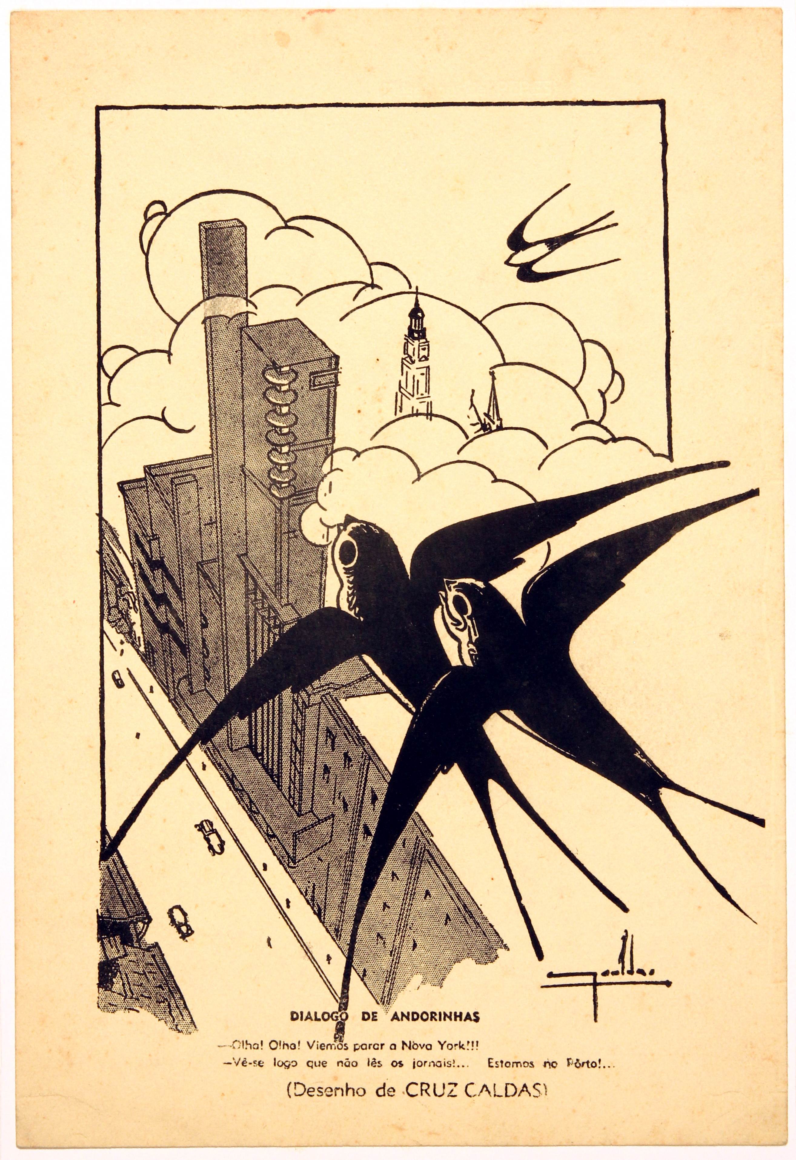
Source. Câmara Municipal do Porto. Arquivo Histórico. Identifier 443600. Note. Caption: "Swallows dialogue [while flying over the Coliseu]: - Look! Look! We've ended up in New York!!! - You obviously don't read the newspapers... We're in Porto!"
Figure 1 Lithographic print published in the newspaper O Primeiro de Janeiro, alluding to the construction of the Coliseu do Porto in 1941
The Coliseu is not just an emotional hub for generations of locals; it is also an advertising spectacle in its own right. Henrique Cayatte (2018) draws attention to the building's advertising façade, a stylistic reflection by architect Cassiano Branco on advertising's role in urban spaces:
the "advertising façades" made it possible to showcase and leverage the communication of the large screens promoting the shows. Unlike Eden [in Lisbon, also by Cassiano Branco], where the building interacts with the vast Praça dos Restauradores, here Cassiano realises the narrow width of Rua de Passos Manuel. (p. 25)
Ana Tostões (2015) also emphasises this interaction between the structure and its surroundings, noting that, more than
shaping a festive programme, it interprets the site in its relationship with the city and the street, understanding the city's topography, becoming an urban landmark with its tower, intended as a celebration, which has come to define the profile of the modern city. (p. 238)
In this way, we retrospectively assign significance to the cultural and social life of Porto events that started in 1941 and have since multiplied in updated occurrences, resonating through the present day. This retrospective helps us understand posters, illustrations, and programmes, which we inevitably interpret today in the dim light of an imagined city. Incorporating the creator's experience intertwined with his environment, we add our own experience of the city, reinterpreting (and appropriating) materials that remain permanently receptive to new discursive modelling, deviating from the crystallisation often imposed on archive records, events, or artistic creations.
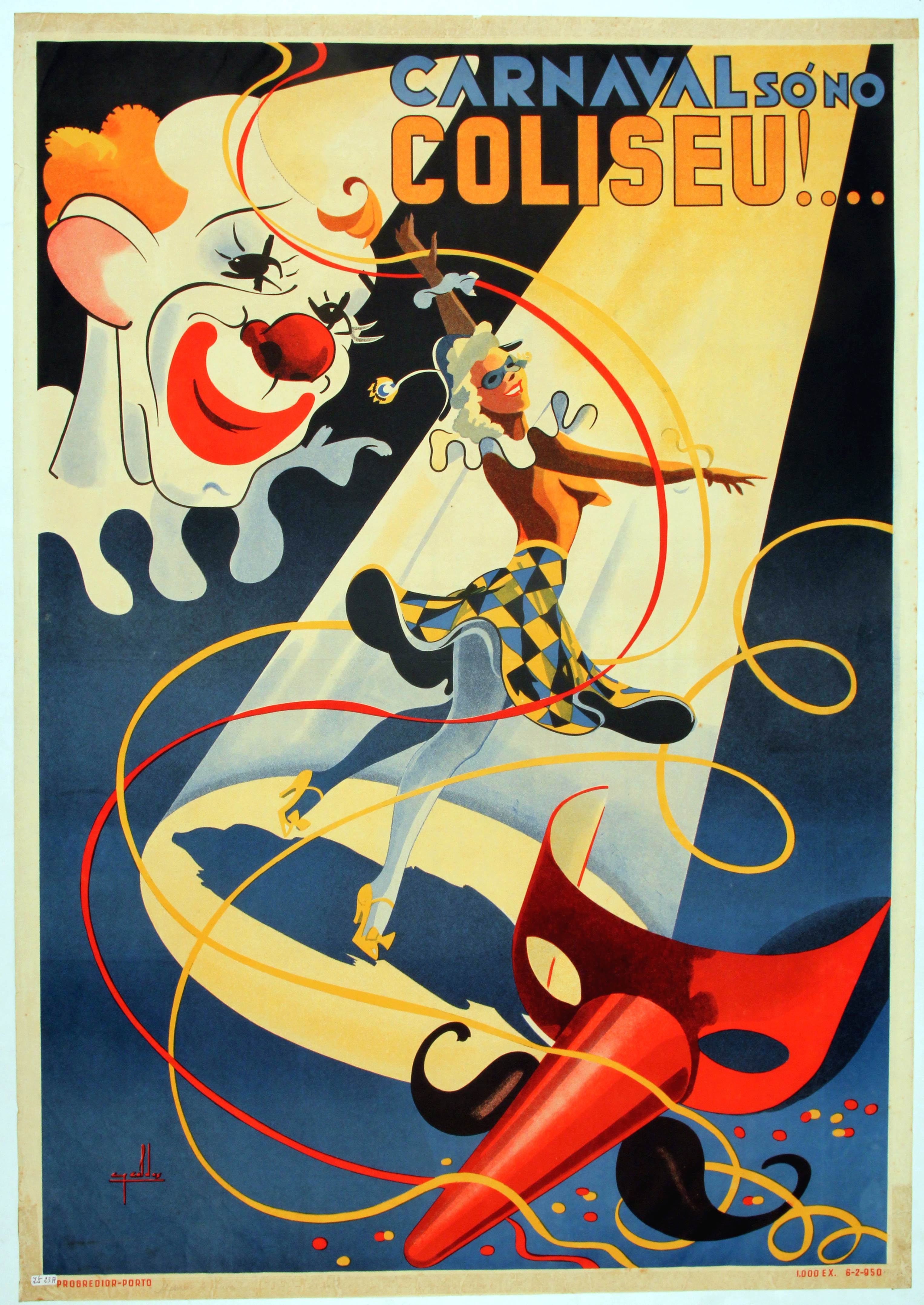
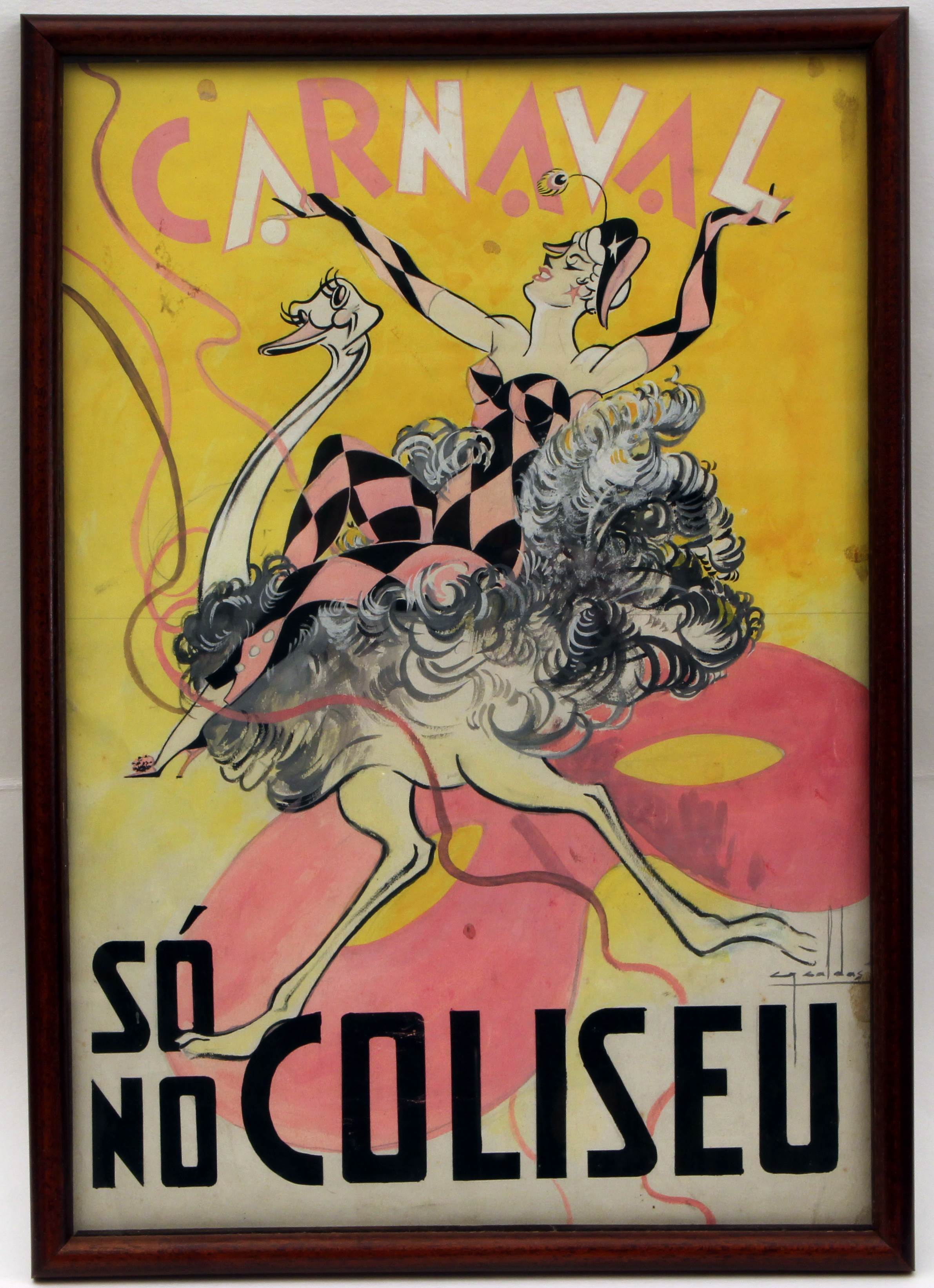
8.2. Carnival Only at the Coliseu!
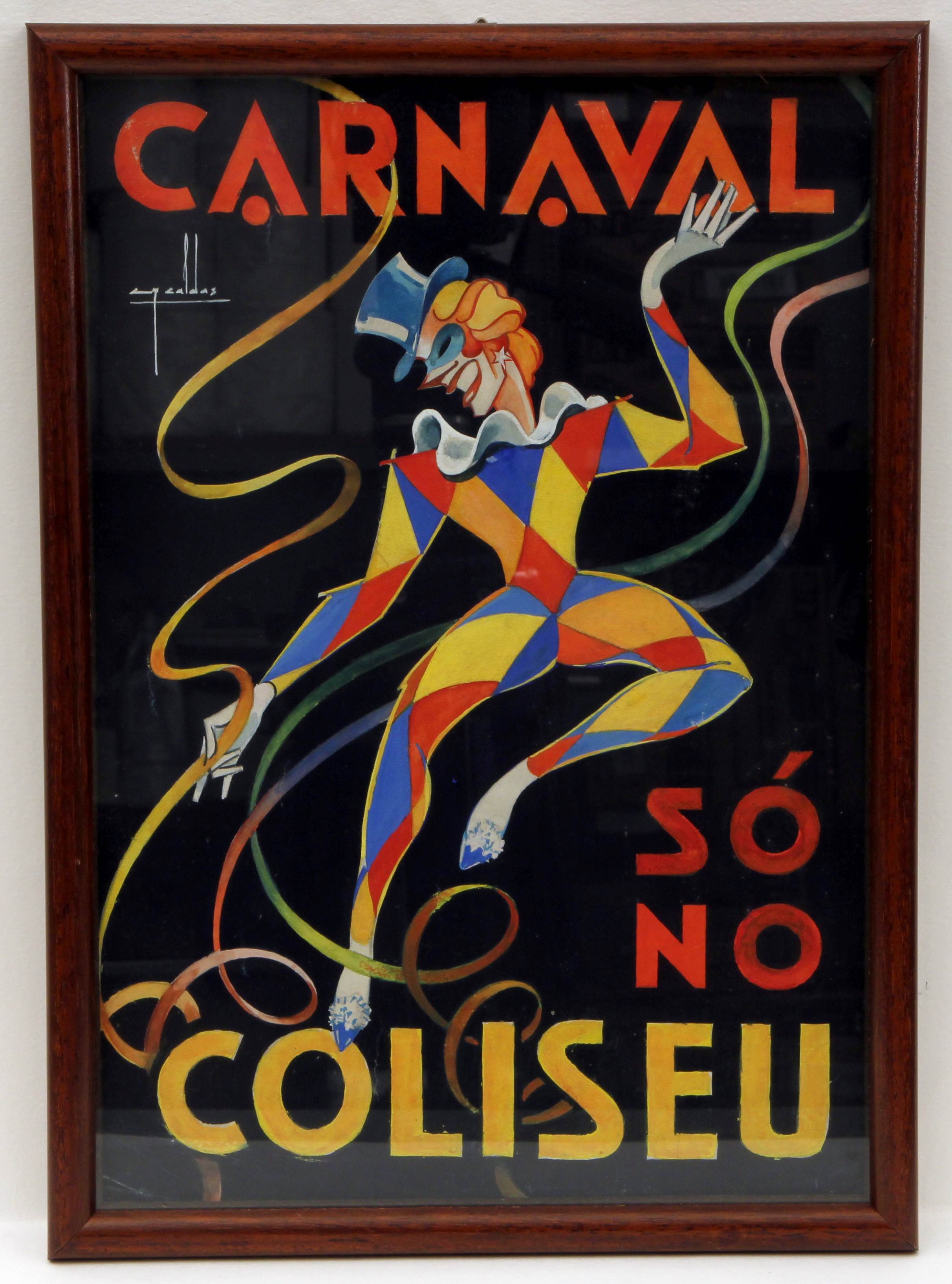
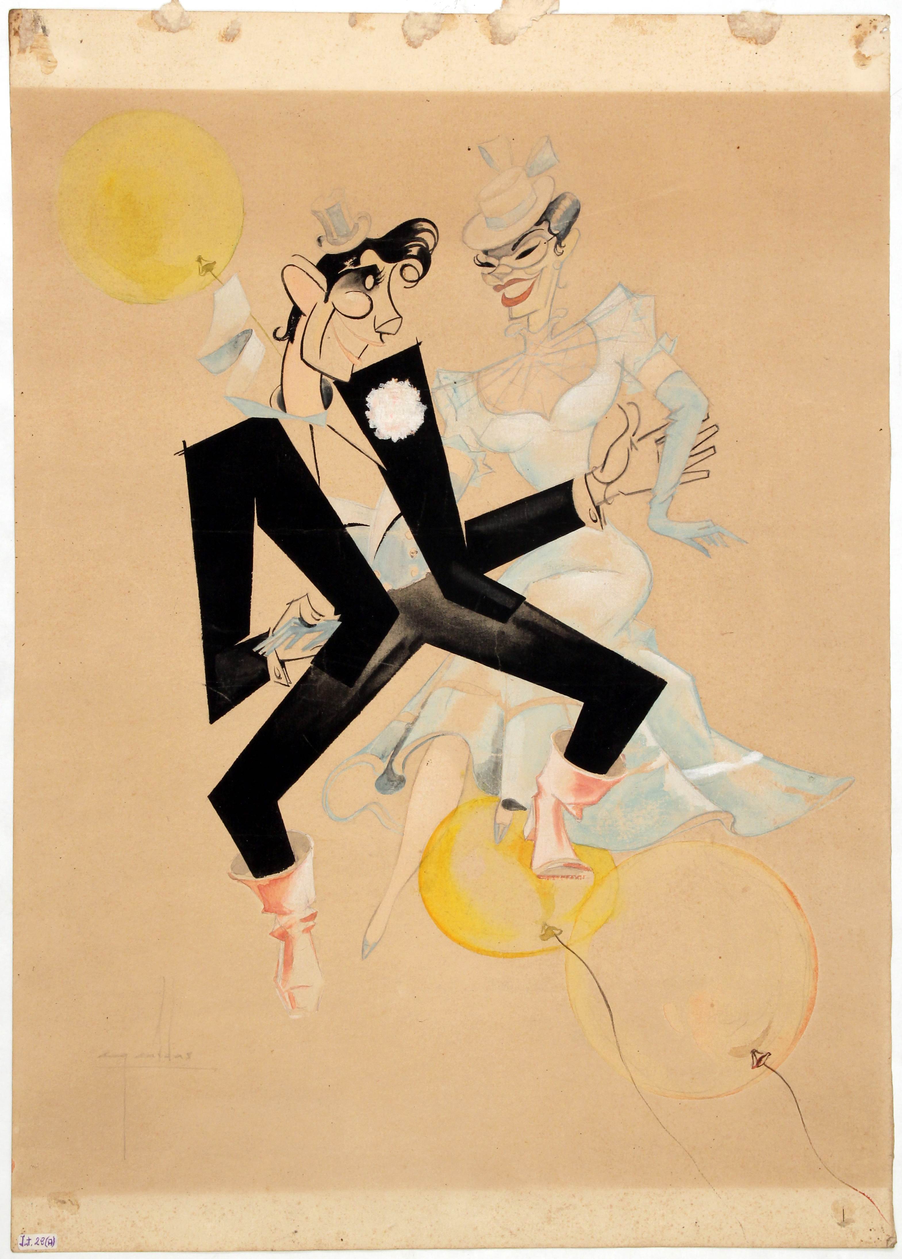
The posters predominantly centre around the Carnival events or masked balls hosted at the Coliseu do Porto, mirroring a popular cultural and social tradition that thrived in major European metropolises during the second half of the 19th century. The assortment of archetypes and multicultural and ideological figurations is evident: from the cancan (a French dance that became popular in music halls in the 1840s, associated with French cabarets such as Moulin Rouge, and later exported to London and New York, mimicked in Figure 2); to the theatre-circus (a show that blends genres and figures, particularly from French/Italian comedy, an example of which is Pierrot - a Commedia dell'Arte character, a French variation on the Italian Pedrolino; Figure 3, Figure 4 and Figure 5); the mask (for example, the mask of Zé Povinho in Figure 6); circus figures (clowns, trained animals, as can be seen in Figure 3, Figure 4 and Figure 7), music hall characters (Figure 8 and Figure 9); markedly ideological imagery (evocative of colonialism and exoticism, as Figure 10 suggests), for example, figures of Black people (as in the case of the newspaper vendor in Figure 11) or exotic icon objects (for example, the Mexican hat in Figure 2). It is worth noting that the materials refer to a period during the Estado Novo, specifically the 40s, 50s and 60s of the 20th century. Overall, the iconography used was multicultural and "universal" at the time (from a European perspective).
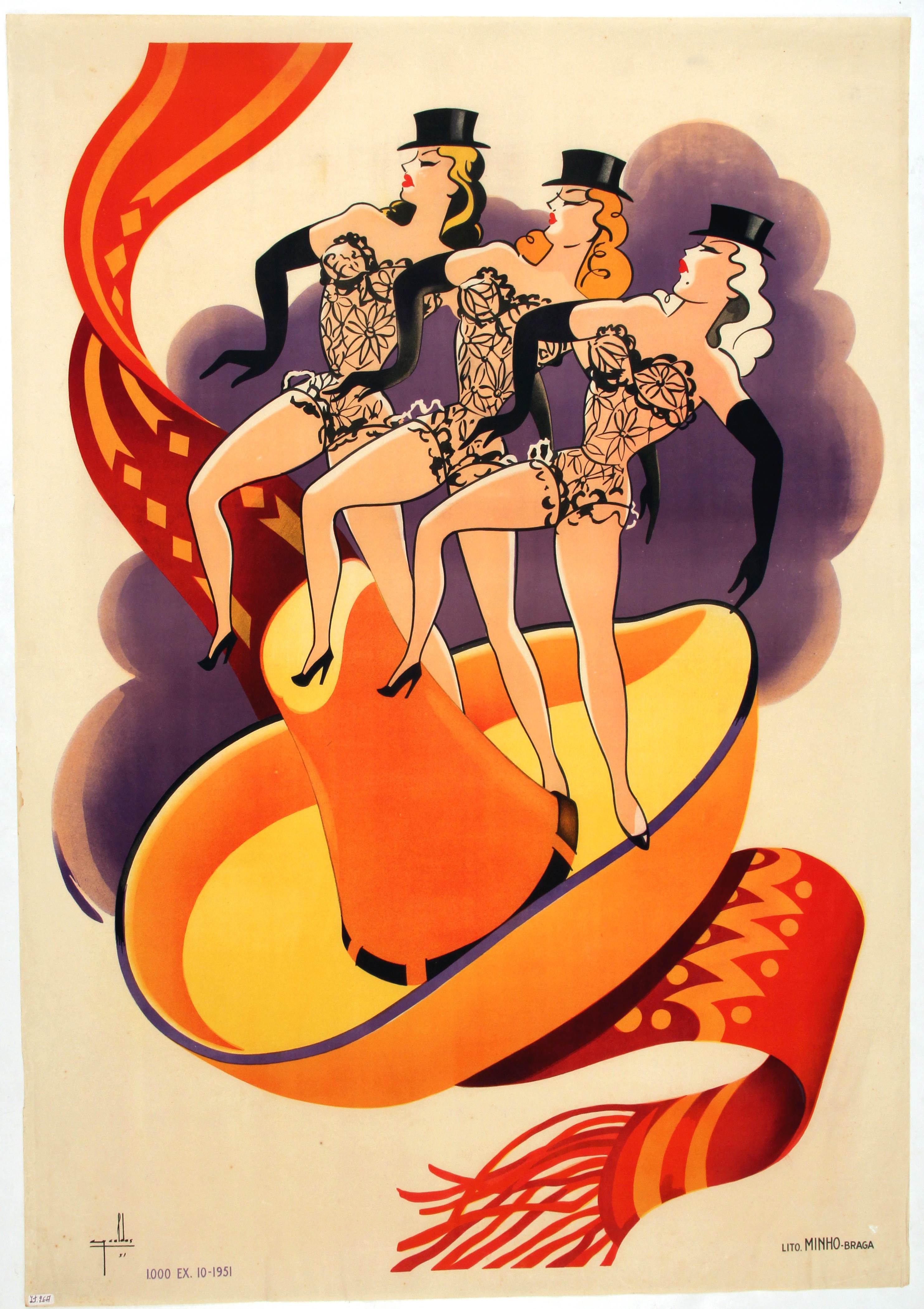
Source. Câmara Municipal do Porto. Arquivo Histórico. Identifier 413783
Figure 2 1951 Carnival poster for the Teatro Circo Coliseu do Porto, printed by Litografia Minho-Braga
Source. Câmara Municipal do Porto. Arquivo Histórico. Identifier 413781
Figure 3 1950 Carnival poster for the Teatro Circo Coliseu do Porto, printed by Litografia Minho-Braga
Source. Câmara Municipal do Porto. Arquivo Histórico. Identifier 513918
Figure 4 Original drawing by Cruz Caldas for a poster commissioned by the Teatro Circo Coliseu do Porto, date unknown
Source. Câmara Municipal do Porto. Arquivo Histórico. Identifier 513908
Figure 5 1959 original drawing by Cruz Caldas for a poster commissioned by the Teatro Circo Coliseu do Porto
Source. Câmara Municipal do Porto. Arquivo Histórico. Identifier 422205
Figure 6 Advertising alluding to the Coliseu Carnival in 1948, with an illustration depicting the Coliseu building, surrounded by a Zé Povinho mask, couples dancing on top of the building and a crowd of people and cars outside the cinema
Source. Câmara Municipal do Porto. Arquivo Histórico. Identifier 413964
Figure 7 Study on tracing paper for an advertising poster alluding to Carnival at the Coliseu do Porto, date unknown
Source. Câmara Municipal do Porto. Arquivo Histórico. Identifier 513916
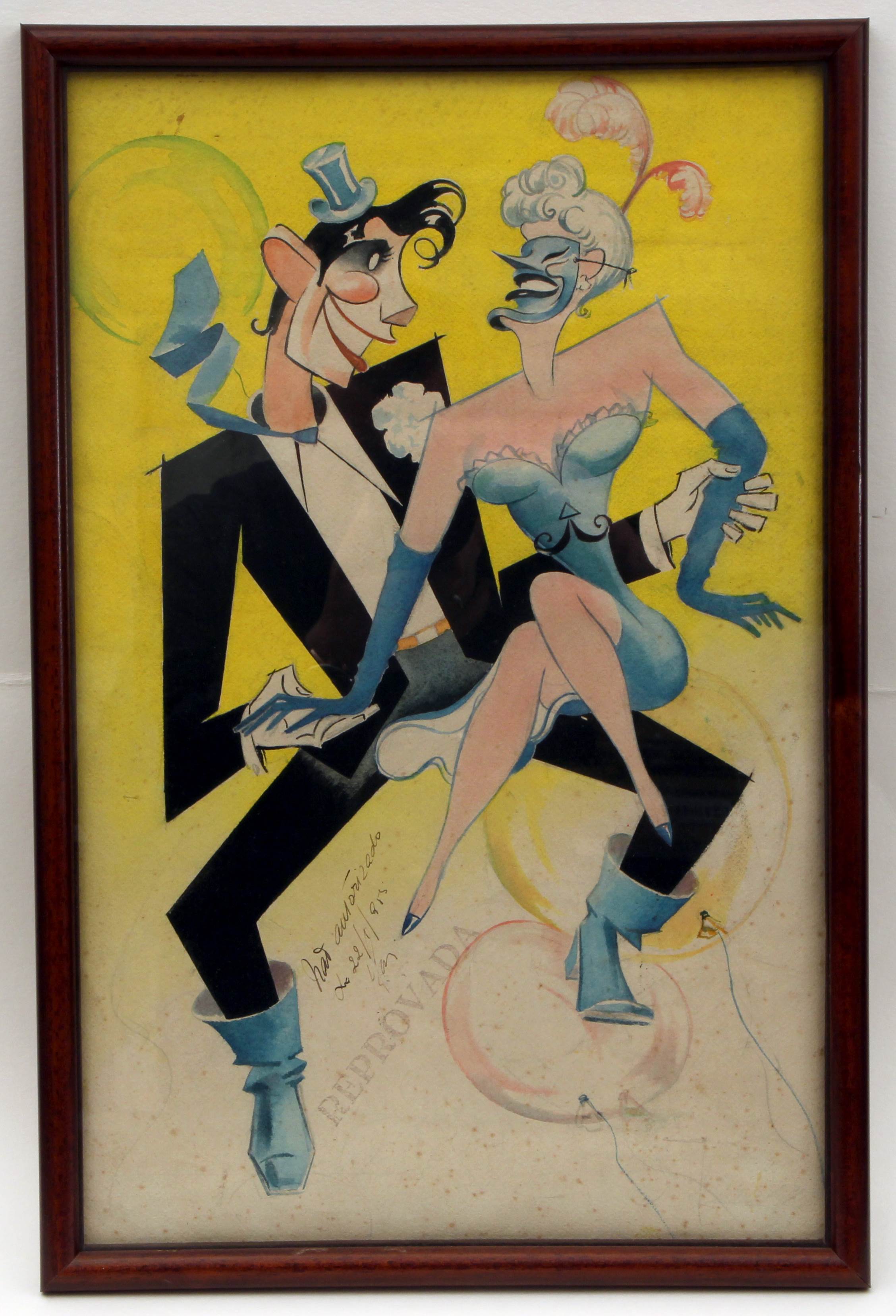
Figure 8 1955 original drawing by Cruz Caldas for a poster commissioned by the Teatro Circo Coliseu do Porto. This drawing was rejected by the censors
Source. Câmara Municipal do Porto. Arquivo Histórico. Identifier 413849
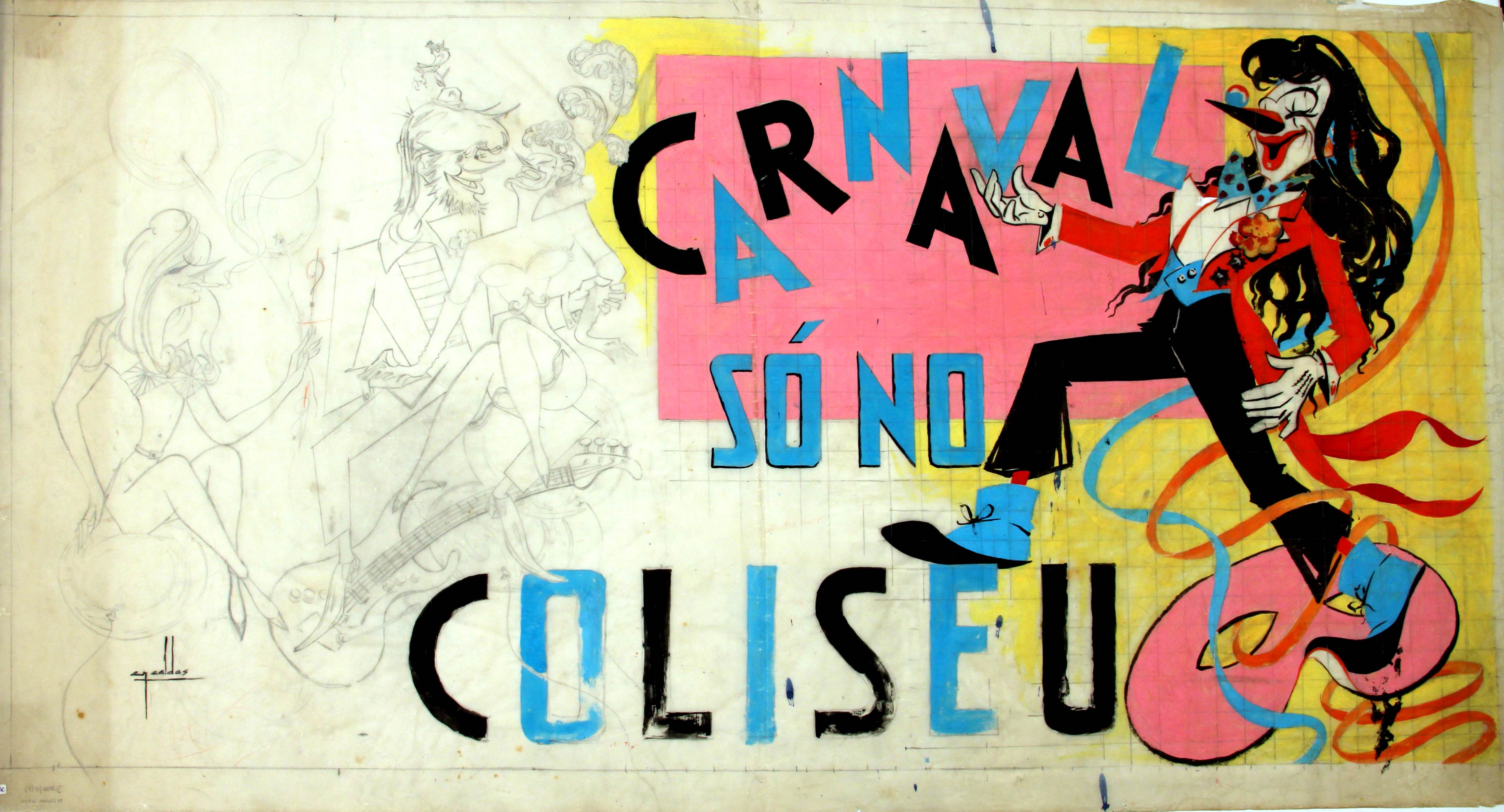
Figure 9 Study of the 1956 poster for Carnival at the Coliseu do Porto
Source. Câmara Municipal do Porto. Arquivo Histórico. Identifier 422187
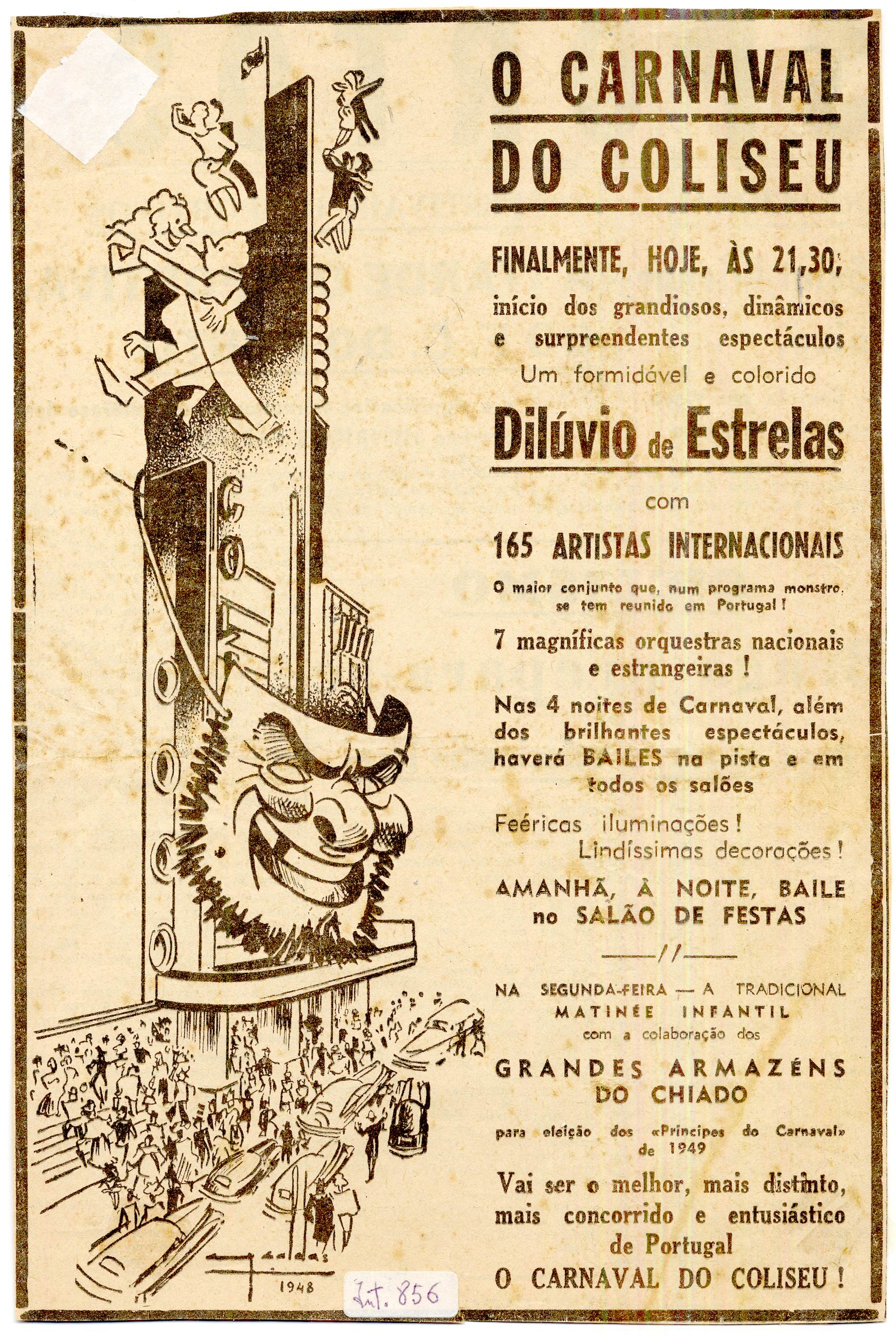
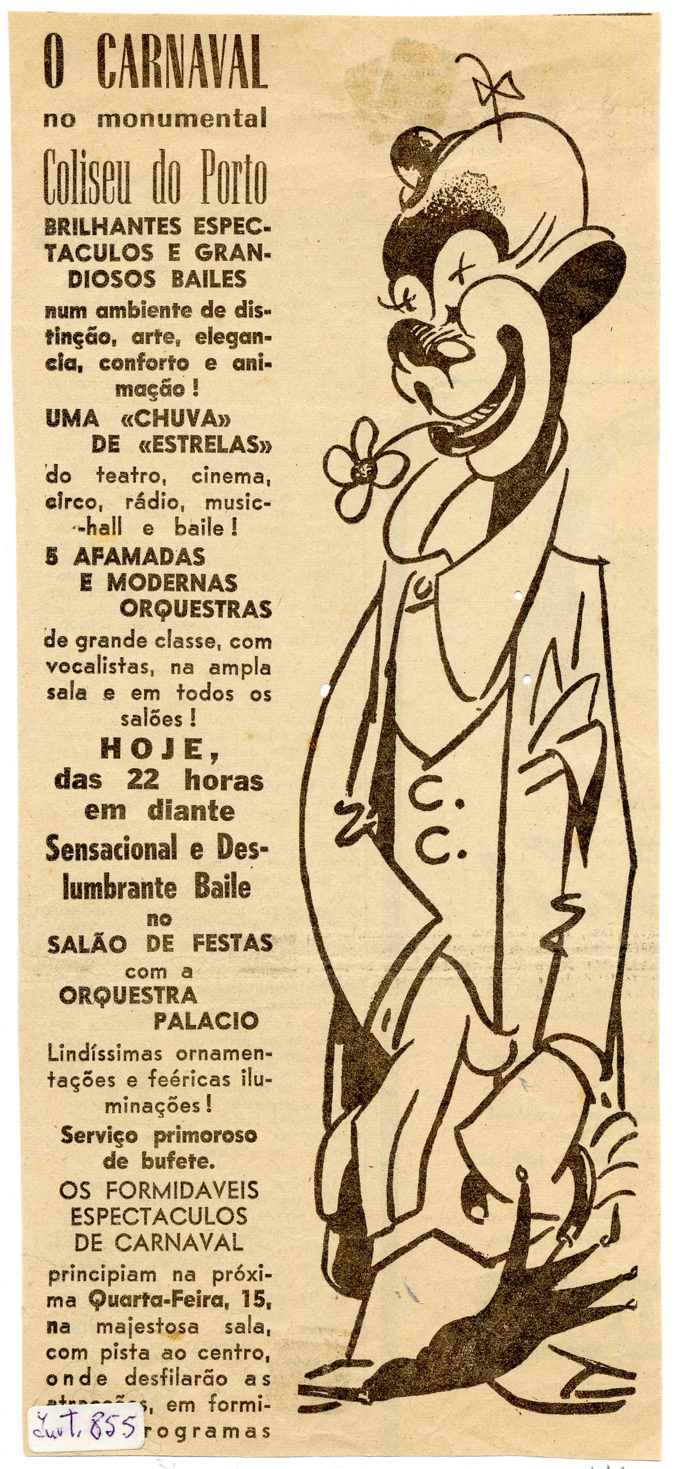
Figure 10 Advert for the Carnival at the Coliseu do Porto in a press cutting, date unknown
Source. Câmara Municipal do Porto. Arquivo Histórico. Identifier 413829
Figure 11 Study on Carnival at the Coliseu do Porto for an advertising poster, date unknown
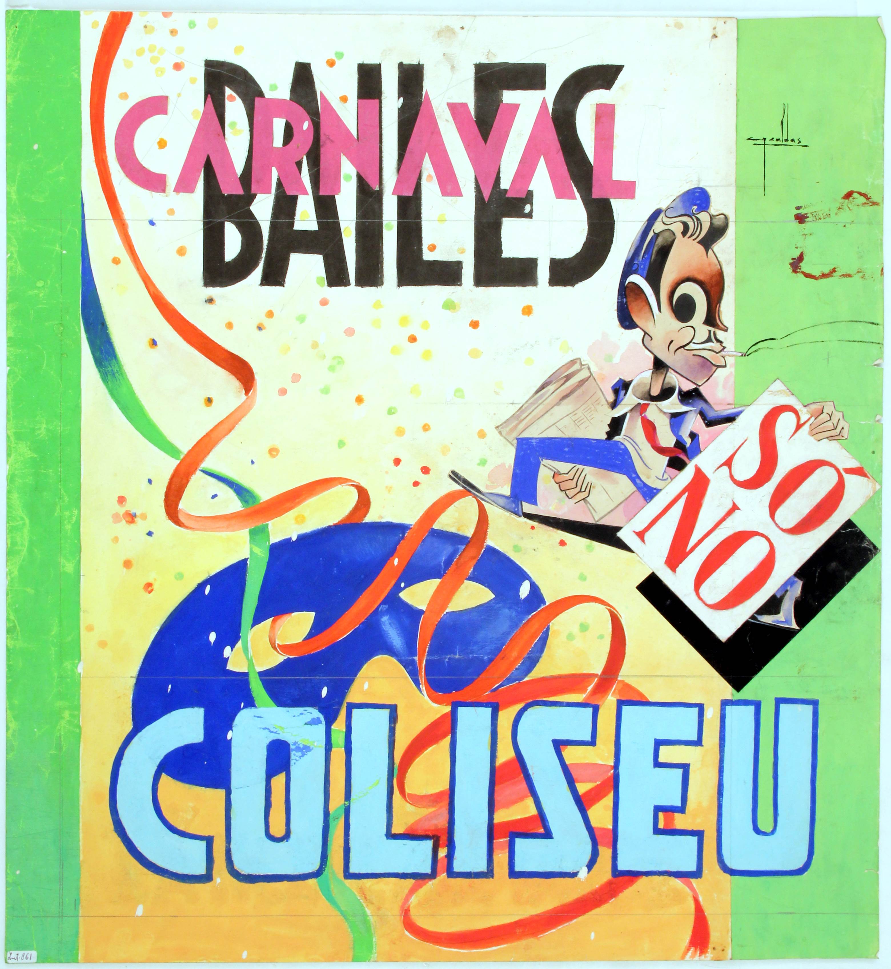
From a formal perspective, the alignment of the materials, particularly the posters, with the principles of the strategy of seduction or advertising effectiveness is noteworthy. In particular, the recurrent use of the slogan (converted into a signature) - "Carnival only at the Coliseu!" -, the chromaticism (warm, vivid and contrasting colours), the prevalence of the image and economy of text and concise language.
The illustrations adhere to a modernist style (of which the Coliseu itself, as a predominantly advertised object, is an iconic example, as in Figure 6, Figure 12 and Figure 13), producing an imaginary that places art in Portugal in line with the futurist variant predominant in the national context during that period. Even so, as with other illustrators, both national and foreign, Cruz Caldas' unique traits are recognisable as some contradictory stylistic elements that are paradoxically extemporaneous to European modernism, such as the adoption of certain graphic mannerisms akin to French styles.
Source. Câmara Municipal do Porto. Arquivo Histórico. Identifier 425501
Figure 12 Illustrated cover of a Coliseu do Porto programme, 1957
Source. Câmara Municipal do Porto. Arquivo Histórico. Identifier 422274
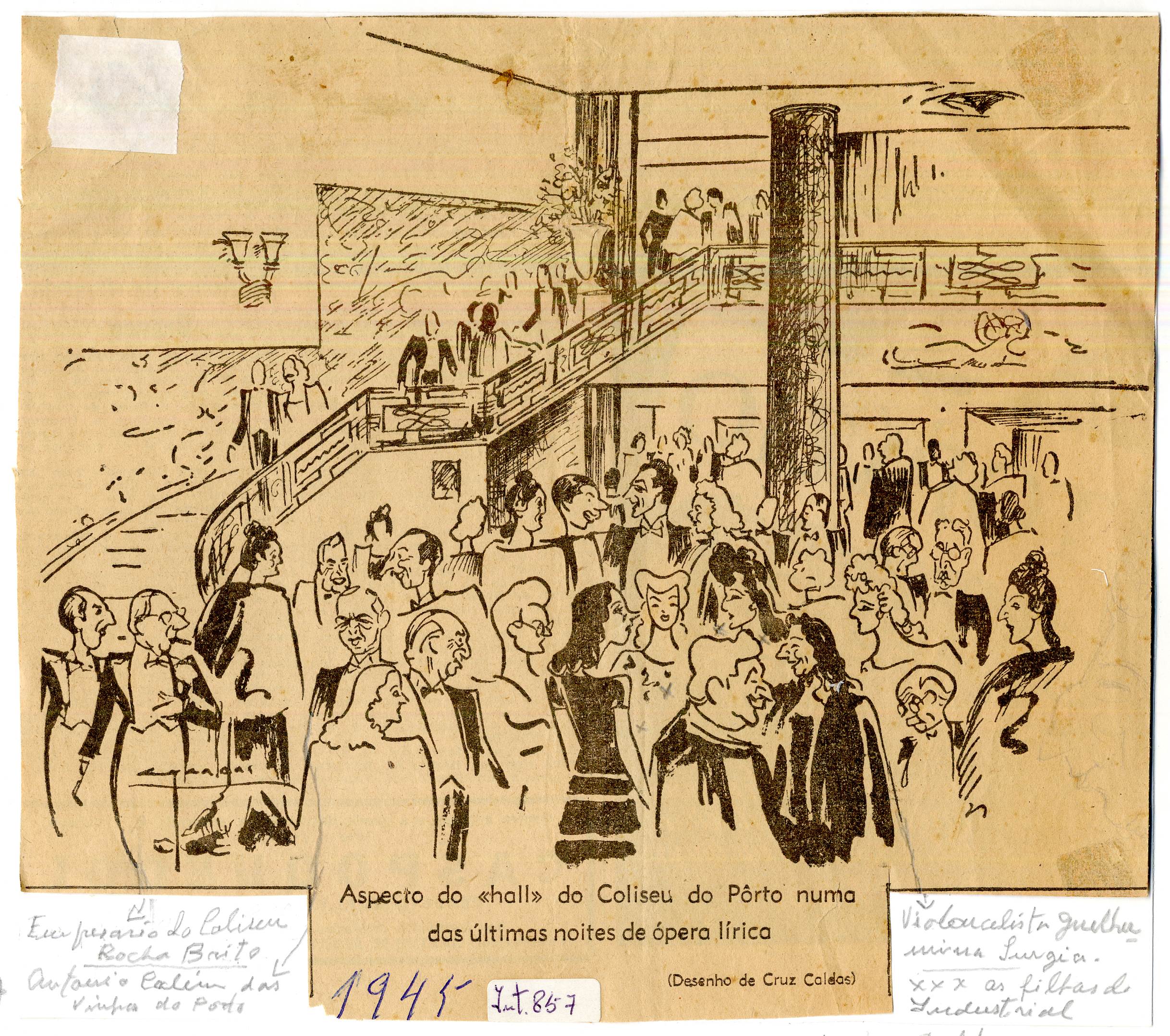
Figure 13 Illustration by Cruz Caldas with figures from Porto's social milieu in the lobby of the Coliseu do Porto in 1945. These illustrious people include the Coliseu's manager, Rocha Brito, the cellist Guilhermina Suggia, a nd the daughters of the industrialist Delfim Ferreira
The posters crafted by António Cruz Caldas for the Carnival balls at the Coliseu do Porto also demonstrate the manual craftsmanship mentioned by Laura Castro (2014), both in the final objects and in the sketches preserved in the author's collection. Dominated by the slogan "Carnival only at the Coliseu!", these posters seem to echo variations of themselves, partially and surprisingly contradicting their manual production, simulating a repetition that was, at the same time, the illustrator's signature style.
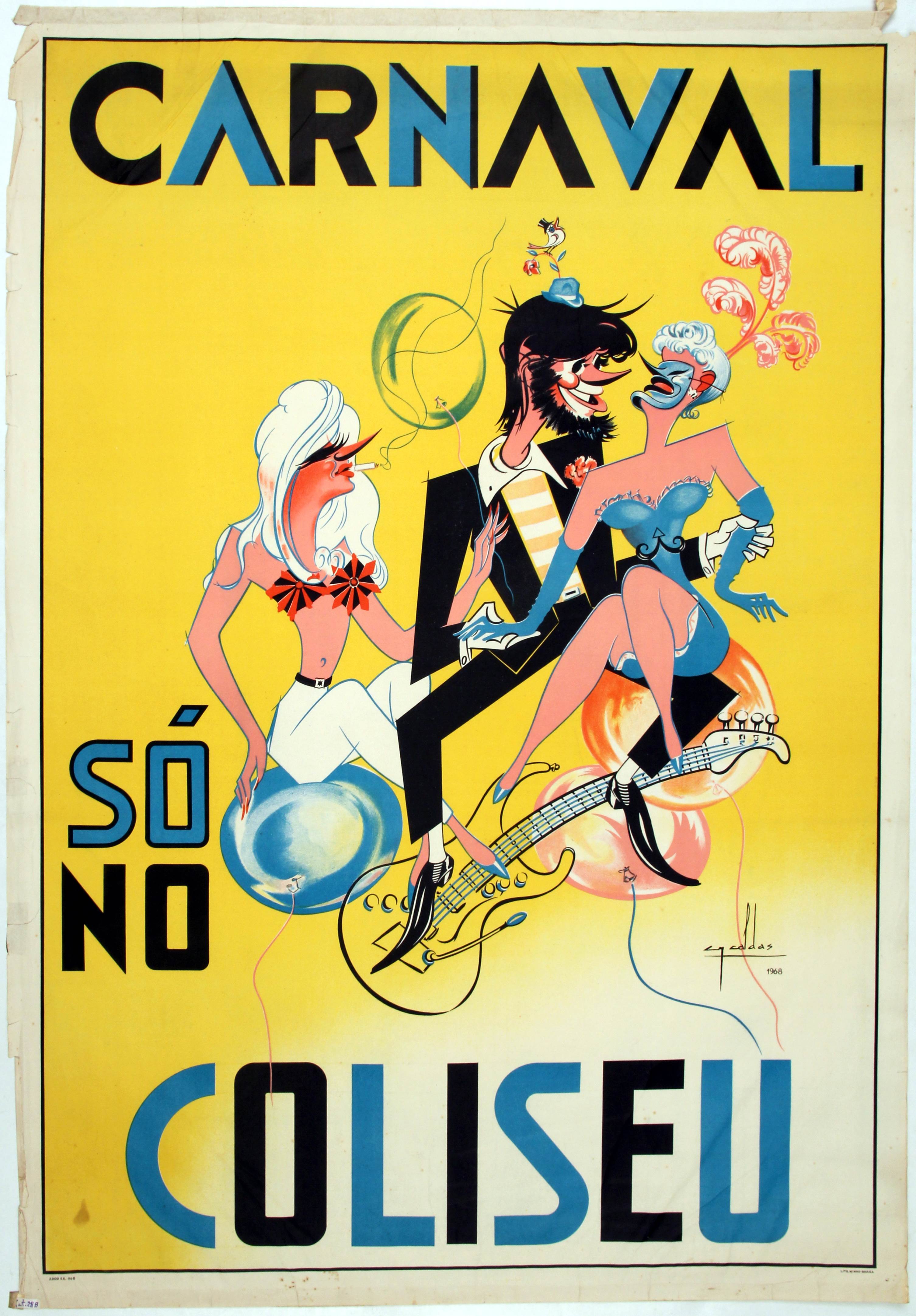
These variations include masks, clown figures and a dancing couple. Movement (a trait of futurist modernism) and colour (an element that has already been highlighted) permeated all the posters, features that were once considered provocative by the dictatorship. The 1955 poster (Figure 8) was rejected by censorship, prompting new versions of the censored model in 1956 (Figure 9) and 1968 (Figure 14), where the latter shows the influence of rock 'n' roll. These examples demonstrate a diverse use of materials (pencil sketches, ink drawings, gouache, first experiments on tracing paper) in crafting the posters, most of which were printed at Litografia Minho.
Source. Câmara Municipal do Porto. Arquivo Histórico. Identifier 413786
Figure 14 1968 Carnival poster for the Teatro Circo Coliseu do Porto, printed by Litografia Minho-Braga
Also featuring both the posters and the lithographic proofs sent for publication in local newspapers (such as O Primeiro de Janeiro) is the figure of Zé Povinho, who is very expressive in the advertising for the 1948 Carnival. The artwork illustrates the Coliseu building surrounded by a mask of this popular figure and couples dancing atop the structure (Figure 6).
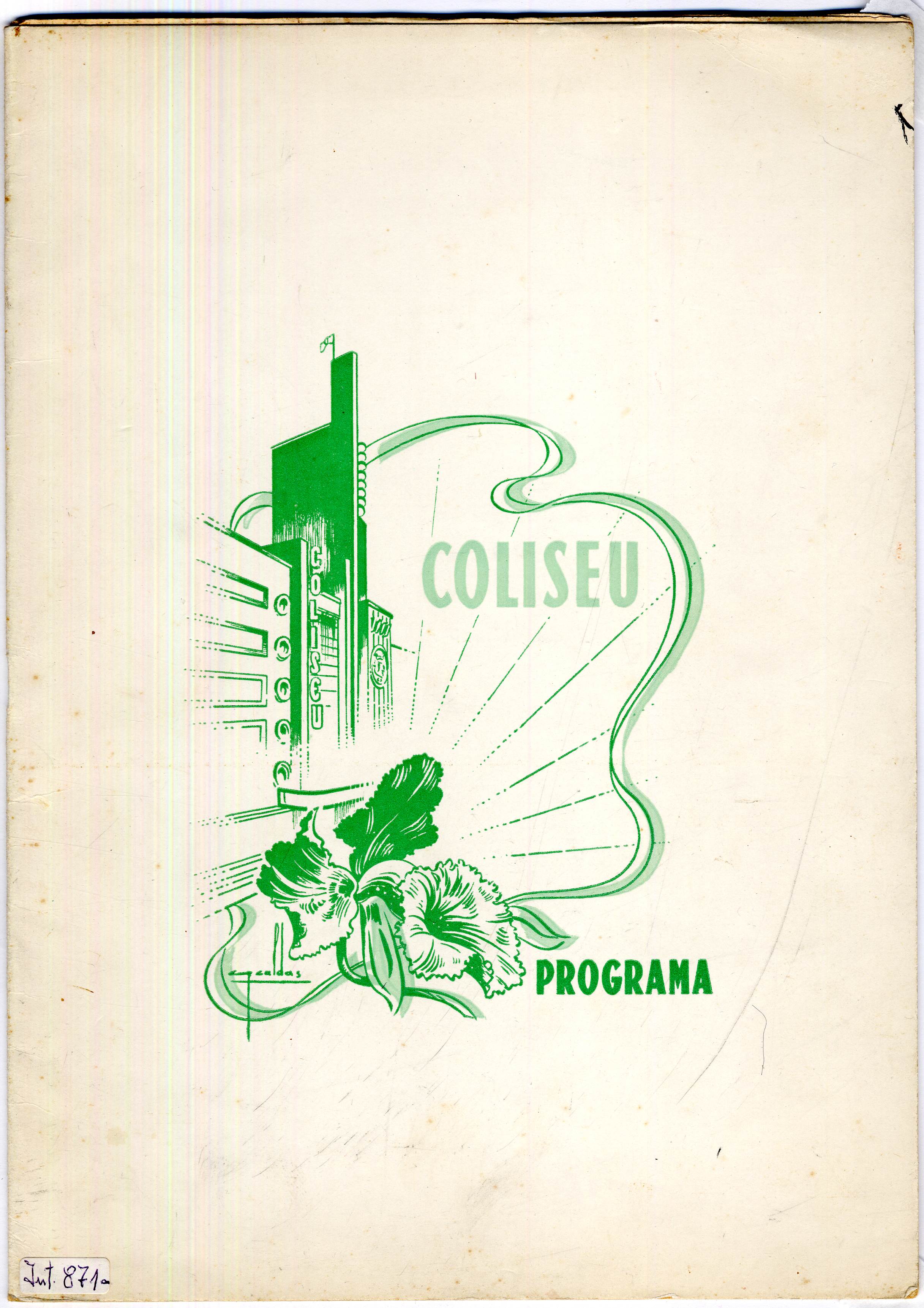
8.3. Programmes and Figures from Porto
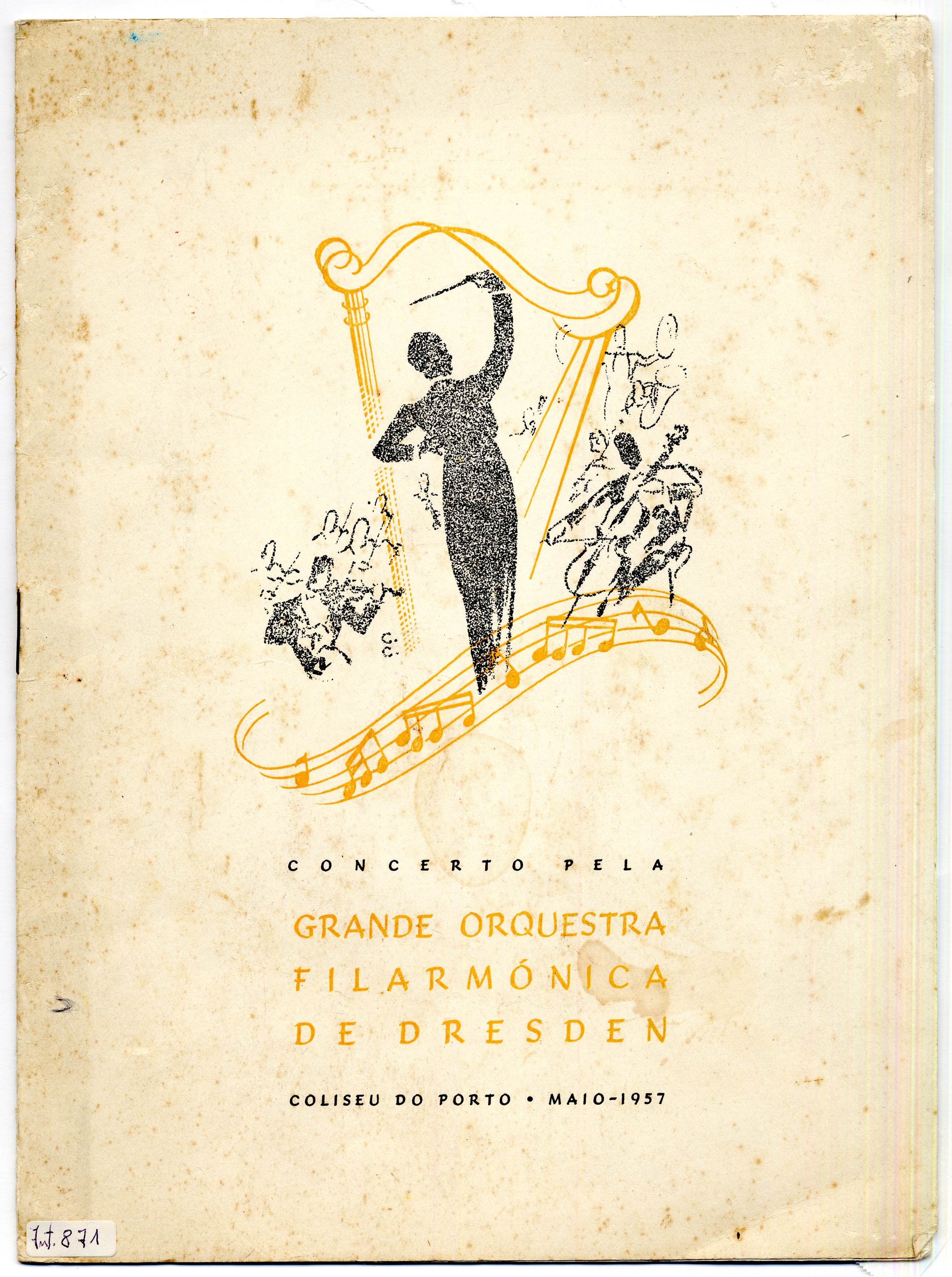
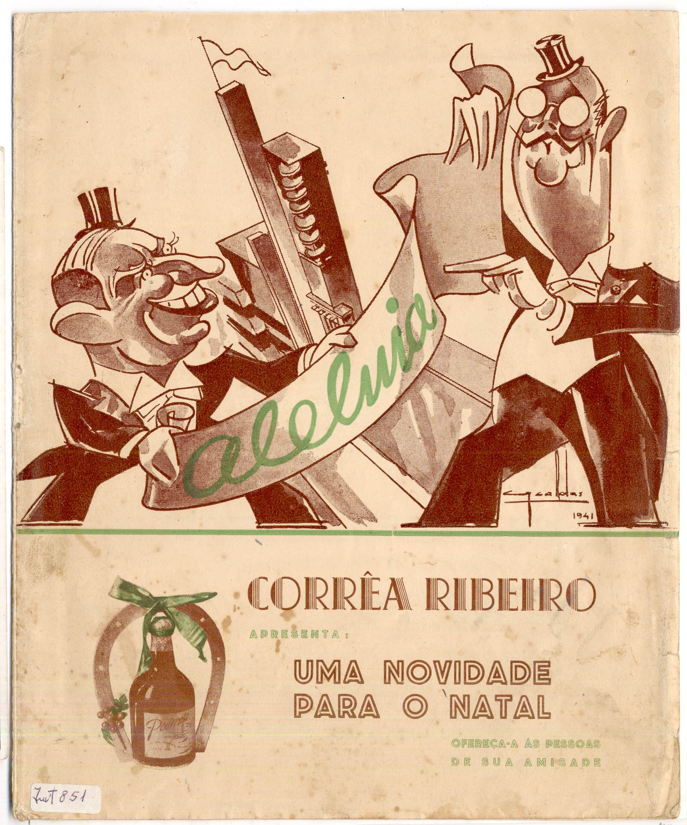
Finally, as a complement to the posters, we would like to delve into the Coliseu's show programmes (Figure 12, Figure 15 and Figure 16) for their enormous iconographic profusion (the covers, illustrated by Cruz Caldas, showcasing the building) and programme (offering a chronological insight into the staged performances at the Coliseu). While acknowledging these characteristics, however, we want to emphasise the very rich social and symbolic value of these documents, embedded in their advertisements promoting diverse brands: Bolachas e Biscoitos Paupério, Corrêa Ribeiro, Pasta Medicinal Couto, Viarco or Benzo-Diacol. Extracting insights from these adverts3, we uncover references to the typography prevalent in advertising at that time, forms and lifestyles (advertising children's shoes or fashion shops) and even representations of female identity, for example in the advertisement for Taky depilatory cream.
Source. Câmara Municipal do Porto. Arquivo Histórico. Identifier 425506
Figure 15 Illustrated cover of a Coliseu do Porto programme, 1957
Source. Câmara Municipal do Porto. Arquivo Histórico. Identifier 422133
Figure 16 Programme for the play Aleluia premiered at the Coliseu do Porto in December 1941
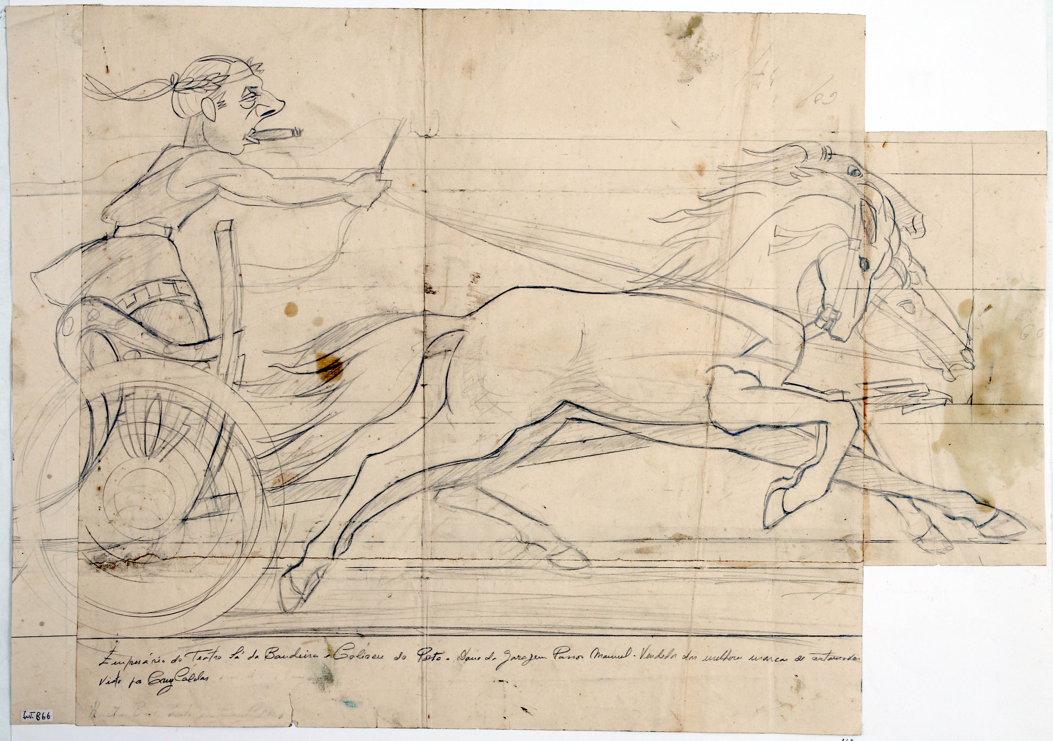
With a keen sense of humour, António Cruz Caldas' illustrations depict social groups and illustrious figures from the city at the time. Such is the case of the pencil portrait of Rocha Brito, the entrepreneur behind the Sá da Bandeira and the Coliseu do Porto theatres, owner of the Passos Manuel garage, attired as a Roman (Figure 17) at a horse race. Illustrations like this one offer a glimpse into Cruz Caldas' sentiment of the ambience on event days at the Coliseu, showcasing prominent figures from Porto's social milieu congregating in the lobby of the Coliseu do Porto on an opera night (Figure 13).
9. What Imaginary(s) Do Cruz Caldas' Posters Draw?
After an integrated analysis between these examples and Moles' classification structure (approached in a wandering style, as befits the apprehension of the elements gravitating around the city), we proceed to an attempt to systematise the material collected in order to support our standpoint more clearly and aim for consistent outcomes for the proposed objectives. Thus, we undeniably identified an informative function in each of these pieces, which is essentially pragmatic. Intended for the target audience (which could be either the reader of the local newspaper or the passer-by near the Coliseu do Porto), the posters conveyed upcoming events (Carnival ball or a concert), venue details (sometimes specifying the ballroom or associating directly with the Coliseu building itself, highlighted by name or graphic symbol). However, while informational elements are introduced for efficiency, the seduction strategy is imposed as persuasion. In this chapter, from the colours to the sexualised figures mentioned above to the appeal of the shapes and the illusion of movement in many of these copies, all unite in an unmistakable invitation to the presented proposals.
Seduction seamlessly intertwines with the aesthetic and poetic function, where one is informed because it is imperative and seduced because attraction leans toward the suggested allure over the straightforward openness of information. In this respect, the signs of visual poetics emerge through the cartoonish elegance of figures, the minimalist lettering, and the slogan, which is both information and suggestion: “Carnival, only at the Coliseu!”. This advertising mantra evokes a party atmosphere (like a tantalising promise) in a venue (the Coliseu) treated like a character in the city. Everyone knows the Coliseu, which is referred to informally as the companion you have known for several carnivals. From this, it becomes apparent that Cruz Caldas's posters, collectively representing these concepts, embody a total creative product, verging on artistic creation. Cruz Caldas demonstrates a clear command of drawing skills (inherited from his fine arts education), while simultaneously showcasing a keen sense of form, colour harmony, and spatial arrangement. However, mastery transcends mere technical expertise, delving into an artistic dimension, as each analysed piece produces imaginaries: urban, political and social. That brings us to Moles' (1969/1987) concepts of "education" and "culture". As we have seen, the posters, illustrations and programmes created by Cruz Caldas embody political connotations, although they are subliminal (as observed in the censored posters Figure 8 and Figure 9); social implications (the "colonial" representation of Black people in Figure 10 and Figure 11); cultural meanings (portraying and satirising elements of Porto's elite in Figure 17) and even educational intents, as we can see in the announcement of the opening of the Coliseum (Figure 1).
The analysis undertaken (a fusion of metaphorical interpretation and systematic examination) propels us toward formulating hermeneutic conclusions, recognising that interpretations and imagery are perpetually open-ended. They defy finality in a singular reading, continuously evolving with fresh reinterpretations (Ricoeur, 1976/1987).
Throughout this analysis, our focus lies in delving into the social dimension of advertising posters within the city, weaving this perspective into the prevailing aesthetic currents of the era. Since its establishment in 1941, the Coliseu do Porto has stood as an icon within the city, persisting as a symbol that embodies and enlivens Porto's cultural and social pulse. The advertising posters (the productions by Cruz Caldas presented here) are an agent and reflection of this life, encapsulating the essence of the modernist spirit in images and slogans. The futuristic impetus of the Coliseu do Porto, which stood as open and modern since its inception, is not only mirrored in Cruz Caldas' illustrations but also in the architectural project itself (and the symbolic significance attached to its genesis rooted in the affluent and bourgeois elite of Porto). It condenses the stylistic traits of the modernist current that still make the Coliseu an imposing presence in the city's landscape and imaginary. Even if these manifestations remain somewhat anonymous in this age of digital hyperstimulation, the Coliseu's advertising legacy (its lettering displayed vertically and horizontally, imposing itself elegantly on the street, the irresistible sharp design by Cruz Caldas, so current in its apparent anachronism) makes us question the importance of advertising visuality as a form of expression (and production) of cultural life in society.
We must emphasise, firstly, the role of Cruz Caldas' posters in producing memories of an emerging social and cultural life. It should be noted that the socio-cultural references of the great metropolises of the second half of the 19th century and the first half of the 20th century resonate in the materials analysed. Furthermore, it is interesting to note that these memories nevertheless express an "out of step" (futuristic) modernism, anchored in the particularities of a social, political and ideological context that, paradoxically, seems to be both aligned with trends in other urban cultural geographies and indicative of a certain anachronism. On the one hand, Cruz Caldas' posters are projected onto a past, given their apparent inspiration in the style of French posters from the second half of the 19th century, namely Jules Chéret, among other illustrators. On the other hand, as cultural artefacts connected to their time, the same posters demonstrate an aesthetic of modernist inspiration, materialised in the effect of dynamism produced by the images, consistent with the idea of speed that can be associated with Marinetti and futurism in the first half of the 20th century. Even so, this aesthetic record comprises spontaneous fusions, notably evident when considering other European graphic languages from the early 20th century, such as the graphic and advertising production of Aleksandr Rodchenko (Frankel, 1998), among many other references in modernist visual arts.
10. Final Considerations
The posters and programmes António Cruz Caldas produced for the Coliseu do Porto have been catalogued and made available by the Municipal Historical Archive of Porto on the online platform Gisaweb. They represent a small part of the author's prolific professional and artistic activity. In this analysis, we deliberately curated a specific sample due to its pivotal role in establishing a connection between advertising and a significant emblem of the city (the Coliseu do Porto). This intentional selection aimed to derive insights regarding the formation of the collective imaginary from these materials. However, the work of Cruz Caldas should not be restricted only to the sample collected. This analysis is an invitation to delve deeper into the rich graphic legacy housed in the Casa do Infante in Porto. Thus, we should mention the illustrations he produced for local newspapers (O Primeiro de Janeiro and Jornal de Notícias) and his extensive collaboration with Empresa Gráfica do Bolhão, where he was a lithographer and layout designer. Through this advertising agency, we travelled across tourist advertisements for almost every region of the country (Algarve, Minho, Alentejo) in the 50s and 60s. The company's clients included A Confidente, Águas Vidago and Pedras Salgadas.
By incorporating the case of Cruz Caldas into the theoretical discussion, we aimed to shed light on a scientifically unexplored corpus, particularly in the area of visual culture. In reading the material we analysed, we had the opportunity to propose a reinterpretation of its meanings, uncovering the symbolic value embedded within these documents. Rather than treating them as crystallised objects, we sought to present them as dynamic entities engaged in dialogue, offering insights into the landscape of graphic design and visual communication in a specific period in Portugal. This analysis allows us to bridge the past with the present, exploring the dichotomy between the permanent and the ephemeral. In this exploratory, contextual and exemplary analysis, we set out to examine the production methods employed by António Cruz Caldas, a renowned publicist and illustrator in Porto, in his collaboration with the Coliseu do Porto, primarily reflected in posters, but also in programmes and illustrations. We deemed these graphic materials complementary and crucial in reading the posters as representative of the venue's cultural activities.
Cruz Caldas' significance transcends the specifics of his advertising illustrations, playing a pivotal role in shaping collective memory (Halbwachs, 1950/1990) and imaginary (Durand, 1964/1979) that make up the national cultural archive within a distinct historical and cultural context. In the same way, we cannot help but be surprised by their interconnected nature in the multiple and unexpected ways in which these manifestations spread over concomitant styles, summoned from different aesthetic references, a testament to a culture resistant to insularity, embracing contemporaneity across broader geographical landscapes. In essence, delving into Cruz Caldas' work sheds light on the unique manifestation of modernism (or futurism) in Portugal's visual and graphic arts scene.
Regarding the core objective of this article, which was to reflect on the social dimension of the advertising poster, the analysis successfully highlights the advertising poster's significant role as a repository of codes of conduct, hierarchies and even social satire. However, it remains a source of information and memory that is somewhat overlooked in scientific literature. Finally, it is important to emphasise that this contribution marks the outset of various planned research endeavours under the Passeio initiative, all centred on exploring advertising's broader implications within urban settings using archive documents. Notably, - in a statement that is neither exhaustive nor exclusive to the city of Porto - we would like to extend attention to the significant collection of posters the graphic designer João Machado (1942) has been producing for Porto City Council and which the Municipal Historical Archive has been safeguarding since its inception. We would also like to highlight the recent donation of Raul de Caldevilla's archive to the same municipality ("Um Ato de Amor e de Memória": Família Doa ao Município o Espólio de Raul de Caldevilla, 2022). It also identifies future avenues of analysis, including commercial establishments' posters and their art deco façades (examples of art deco in the city, which often incorporated adverts that reflected the nature of the activities they housed). In this way, we hope to record the informative and persuasive wealth of these collections, contributing to the creation of sources of information for the history of graphic design and advertising in Portugal. In addition, as Passeio (Platform for Urban Art and Culture), we strive to imprint a wandering spirit in observing these materials, which is crucial for reshaping the imaginary of the urban space, both past and present.
Acknowledgements
This work is supported by national funds through FCT - Fundação para a Ciência e Tecnologia, I.P., under the project UIDB/00736/2020 (base funding) and UIDP/00736/2020 (programme funding).
REFERENCES
Almeida, B. P. de. (2018). Amarcord no Coliseu. In E. P. Barroso (Ed.), O coliseu e a cidade: 75 anos de histórias em 7 olhares (pp. 55-63). Coliseu do Porto. [ Links ]
Andrade, S. C. (2018). O Coliseu é nosso!: Memórias com três quartos de século da mais emblemática casa de espetáculos do Porto. O Tripeiro, 1, 4-10. [ Links ]
Arquivo Municipal do Porto. (s.d.-a). Caldevilla, Raul de. 1876-1951. Retirado a 20 de abril de 2023 de https://gisaweb.cm-porto.pt/creators/46638/ [ Links ]
Arquivo Municipal do Porto. (s.d.-b). [Propagandas Caldevilla: painéis publicitários]. Retirado a 20 de abril de 2023 de https://gisaweb.cm-porto.pt/unitsof-description/documents/615186/?q=empreza+gr%C3%A1fica+do+bolh%C3 %A3o [ Links ]
“Um ato de amor e de memória”: Família doa ao município o espólio de Raul de Caldevilla. (2022, 22 de julho). Porto. https://www.porto.pt/pt/noticia/umato-de-amor-e-de-memoria-familia-doa-ao-municipio-o-espolio-de-raul-decaldevilla [ Links ]
Baudelaire, C. (2006). A invenção da modernidade (P. Tamen, Trad.). Relógio d’Água. [ Links ]
Benjamin, W. (1992). Sobre arte, técnica, linguagem e política (M. Alberto, M. A. Cruz, & M. L. Moita, Trads.). Relógio d’Água. [ Links ]
Benjamin, W. (2019). As passagens de Paris (J. Barrento, Trad.). Assírio & Alvim. [ Links ]
Brochand, B., Lendrevie, J., Rodrigues, J. V., & Dionísio, P. (1999). Publicitor. Edições Dom Quixote. [ Links ]
Burliuk, D., & Burliuk, V. (1914). Vladimir Maiakovskii. Tragediia v dvukhdeistviiakh s prologom i epilogom. Pervyi zhurnal russkikh futuristov. [ Links ]
Castro, L. (2014). Porto: As marcas que ficam: A publicidade em Cruz Caldas. Câmara Municipal do Porto: Pelouro da Cultura. [ Links ]
Cayatte, H. (2018). Inesquecível. In E. P. Barroso(Ed.), O coliseu e a cidade: 75 anos de histórias em 7 olhares (pp. 25-42). Coliseu do Porto. [ Links ]
Costa, Á. (2018). En su sito. In E. P. Barroso (Ed.), O coliseu e a cidade: 75 anos de histórias em 7 olhares (pp. 49-54). Coliseu do Porto. [ Links ]
Damásio, L. P. de C. (2016). A Galeria de Amadeo - Vida pintada. Subsídios biográficos [Tese de doutoramento, Universidade do Porto ]. [ Links ]
Durand, G. (1979). A imaginação simbólica (F. F. Morna, Trad.). Arcádia. (Trabalho original publicado em 1964) [ Links ]
França, J.-A. (1984). Arte em Portugal no século XX (1911-1961). Livros Horizonte. [ Links ]
Frankel, D. (1998). Aleksandr Rodchenko. Painting. Drawings. Collage. Design. Photography. The Museum of Modern Art. [ Links ]
Guedes, M. (2018). A sala que segreda cidade. In E. P. Barroso (Ed.), O coliseu e a cidade: 75 anos de histórias em 7 olhares (pp. 43-48). Coliseu do Porto. [ Links ]
Halbwachs, M. (1990). A memória coletiva (L. L. Shaffter, Trad.). Vértice. (Trabalho original publicado em 1950) [ Links ]
La Rocca, F. (2018). A cidade em todas as suas formas (A. A. Ramos, Trad.). Editora Sulina. (Trabalho original publicado em 2013) [ Links ]
Louçã, F. (2016, 23 de fevereiro). Publicidade: Os corpos engraçadinhos. Tudo Menos Economia. https://blogues.publico.pt/tudomenoseconomia/2016/02/23/publicidade-os-corpos-engracadinhos/ [ Links ]
Lima, T. (2023, 6 de janeiro). A força catalisadora do mercado do bolhão - Uma flânerie documental. Passeio. https://www.passeio.pt/galeria/a-forcacatalisadora-do-mercado-do-bolhao-uma-flanerie-documental/ [ Links ]
Lima, T., Dias, N., & Tarroso, L. (2023, 5 de maio). Letras de Braga: Um passeio pela tipografia urbana. Passeio. https://www.passeio.pt/galeria/letrasde-braga-um-passeio-pela-tipografia-urbana/ [ Links ]
Lipovetsky, G., & Serroy, J. (2007). L’écran global. Seuil. [ Links ]
Lobo, T. (2001). Cartazes publicitários. Colecção da Empreza do Bolhão. Edições Inapa. [ Links ]
Malraux, A. (1988). As vozes do silêncio (J. J. A. d. Santos, Trad.). Livros do Brasil. (Trabalho original publicado em 1988) [ Links ]
Matos, H. (2013, 13 de setembro). Cartazes publicitários portugueses 1931-1960. Do Tempo da Outra Senhora. https://dotempodaoutrasenhora.blogspot.com/2013/09/cartazes-publicitarios-portugueses-1931.html [ Links ]
Mesquita, F. (2018). Do paleo-cartaz ao cartaz camaleónico. Adverte. [ Links ]
Moles, A. (1987). O cartaz (M. Mendes, Trad.). Editora Perspectiva. (Trabalho original publicado em 1969) [ Links ]
Moreiras, T. (2019). O cartaz publicitário na obra gráfica de António Cruz Caldas [Dissertação de mestrado, Politécnico do Porto ]. Repositório P. Porto. http://hdl.handle.net/10400.22/15325 [ Links ]
Pinto-Coelho, Z. (2020, janeiro). A vida social dos cartazes de protesto. Passeio. https://www.passeio.pt/galeria/a-vida-social-dos-cartazes-de-protesto/ [ Links ]
“Pioneiro da publicidade portuguesa na Toponímia de Lisboa”. (2013, 20 de março). Toponímia de Lisboa. https://toponimialisboa.wordpress.com/2013/03/20/pioneiro-da-publicidade-portuguesa-na-toponimia-de-lisboa/ [ Links ]
Pires, H., & Mesquita, F. (2018). Publi-cidade e comunicação visual urbana. CECS/UMinho. [ Links ]
Ricoeur, P. (1987). Teoria da interpretação (A. Mourão, Trad.). Edições 70. (Trabalho original publicado em 1976) [ Links ]
Rinehart, R., & Ippolito, J. (2014). Re-collection: Art, new media, and social memory. The MIT Press. [ Links ]
Ruttmann, W. (Diretor) (1927). Berlin: Die Sinfonie der Großstadt [Filme]. Fox Film. [ Links ]
Sartre, J.-P. (2002). A imaginação (M. J. Gomes, Trad.). Difel. (Trabalho original publicado em 1936) [ Links ]
Shaw, M. (2021, 11 de maio). “This is exciting for artists”: Is this project the future of billboards? The Guardian. https://www.theguardian.com/artanddesign/2021/may/10/sunsetstrip-west-hollywood-digital-billboards [ Links ]
Tostões, A. (2015). A idade maior: Cultura e tecnologia na arquitetura moderna portuguesa. Faculdade de Arquitetura da Universidade do Porto. [ Links ]
Trindade, L. (2008). Foi você que pediu uma história da publicidade? Tinta-da-China. [ Links ]
Vertov, D. (Diretor) (1929).Chelovek s kino-apparatom [Filme]. Leopardo Filmes. [ Links ]
Weill, A. (1984). L’affiche dans le monde. Somogy. [ Links ]
1The available sources are inconsistent as to the date, although it is certain that the agency was created in the first decade of the 20th century. Refer to Lobo (2001) and Arquivo Municipal do Porto (n.d.-a).
2Note the artist's illustrations in David Burliuk and Vladimir Burliuk (1914).
3See https://gisaweb.cm-porto.pt, identifiers 776062, 776064, 776074.
Received: June 09, 2023; Revised: September 20, 2023; Accepted: September 29, 2023
 Este é um artigo publicado em acesso aberto sob uma licença Creative Commons
