


Services on Demand
Journal
Article
 text in
  English (pdf)
 Article in xml format
 Article references
 Send this article by e-mail
Indicators
-
 Cited by SciELO
 -
 Access statistics
Related links
-
 Similars in
SciELO
Similars in
SciELO
Share

 Permalink
Comunicação e Sociedade
Print version ISSN 1645-2089On-line version ISSN 2183-3575
Comunicação e Sociedade vol.43 Braga June 2023 Epub May 31, 2023
https://doi.org/10.17231/comsoc.43(2023).4338
Thematic Articles
Design in Health Data Communication: Infographics About COVID-19 in Rio Claro Municipality
i
, Conceptualization, data curation, formal analysis, investigation, methodology, writing - original draft, writing - review & editing http://orcid.org/0000-0002-5566-8839
ii
, Data curation, formal analysis, investigation, methodology, writing - original draft, writing - review & editinghttp://orcid.org/0000-0003-2218-283X
iii
, Data curation, formal analysis, investigation, methodology, writing - original draft, writing - review & editinghttp://orcid.org/0000-0003-0660-5935
iPrograma de Pós-Graduação em Gestão de Políticas Públicas, Escola de Artes, Ciências e Humanidades, Universidade de São Paulo, São Paulo, Brazil
iiCentro de Apoio Técnico Científico, Instituto de Saúde, São Paulo, Brazil
iiiPrograma de Pós-Graduação em Saúde Pública, Faculdade de Saúde Pública, Universidade de São Paulo, São Paulo, Brazil
A COVID-19 colocou na agenda pública a necessidade de disseminação de informações confiáveis sobre o cenário epidemiológico da doença nas diversas regiões do mundo. No Brasil, vários gestores assumiram a tarefa de informar a população local sobre a progressão da pandemia em seus municípios. Neste estudo, o objetivo foi refletir sobre a construção/elaboração de boletins/infográficos da COVID-19 e da centralidade do design na disseminação de informações em saúde, analisando, para tal, 133 infográficos sobre os números da doença publicados no Instagram da Fundação Municipal de Saúde de Rio Claro, no interior do estado de São Paulo/ Brasil, no período de 30 de março a 31 de julho de 2020. A análise qualitativa realizada a partir da perspectiva multimodal possibilitou identificar que esses foram construídos num processo iterativo, com alterações ao longo do tempo para excluir ou incluir informações à medida que a pandemia se espalhava no município. Os infográficos foram analisados em três dimensões: formato, cores e conteúdo. Concluímos que a sua elaboração foi baseada em conceitos básicos do design relativos à forma e às cores e que nos primeiros cinco meses foram produzidas três versões num processo de refinamento do desenho e das informações até conseguir um formato mais consistente para a comunicação dos dados da pandemia da COVID-19.
Palavras-chave: infodesign; comunicação digital e visual; comunicação em saúde; infográficos; COVID-19
COVID-19 brought to the public agenda the need for disseminating reliable information on the epidemiological scenario of the disease in various regions of the world. In Brazil, several managers took on the task of informing the local population about the progression of the pandemic in their municipalities. This study aimed to reflect on the construction/design of COVID-19 bulletins/infographics and the central importance of design in disseminating health information. To this end, we analysed 133 infographics on the disease numbers published on Instagram of the Municipal Health Foundation of Rio Claro, in the interior of São Paulo state in Brazil, between March 30 and July 31, 2020. The qualitative analysis from the multimodal perspective made it possible to identify that these were built in an iterative process, with changes over time to exclude or include information as the pandemic spread in the municipality. The infographics were analysed in three dimensions: format, colour and content. We concluded that their elaboration was based on basic design concepts concerning shape and colours. In the first five months, three versions were produced to refine the design and information until attaining a more consistent format for communicating the data of the COVID-19 pandemic.
Keywords: information design; digital and visual communication; health communication; infographics; COVID-19
1. Introduction
In the COVID-19 pandemic, one of the greatest challenges governments at all levels of public management faced was establishing effective communication about the evolution of the health crisis and measures to prevent the spread of the virus, the number of daily cases and, later, vaccination. All these aspects were essential to guide the population, coordinate services to care for the sick, and ensure the full operation of health systems.
In many countries, however, the communicational response to the pandemic was permeated by traditional modes of political communication, marked by the absence of coordination and cooperation between the various stakeholders involved in the management of public information about the pandemic, including rulers, health authorities and experts (Lopes et al., 2021). In the Brazilian case, due to the president’s political interests who denied the severity of the health crisis from the beginning (Duarte & César, 2021; Malinverni & Brigagão, 2020; Ricard & Medeiros, 2020), true communicational chaos contributed to the uncontrolled pandemic.
Despite the federal government’s position of denying or minimising the health crisis at the regional and local levels, most governors and mayors did not shy away from the institutional role that the office imposes and that the Unified Health System recommends and sought to inform the population about the evolution of the pandemic in different places. Thus, several municipalities published daily bulletins with data on the numbers of the pandemic at the local level, disseminated primarily through social networks such as Facebook, Instagram and Twitter (Santos et al., 2021).
In a pandemic context, epidemiological data are essential for management to trace the infectious profile and contagion of a disease in a given region and, thus, subsidise and guide the decision-making process of both managers and the population, individually and collectively, according to the characteristics of different regions of the country. Hence, it is not enough to inform about the numbers; it is important to design communicational strategies that prompt the reading and understanding of the data. This is why design plays a key role, since it allows for the visual communication of epidemiological data, thus potentially expanding the dimensions and scope of health information, especially when it is aimed at the general public and the circulation through digital social media (Baldapan & Talde, 2022).
According to the Pan American Health Organization (2018), risk communication for public health and emergencies includes: “transparency and dissemination of information; Coordinating public communication; Risk communication for public meetings and press conferences; Listening through dialogue; Developing risk communication capacity and national plans of action” (para. 3).
Thus a pandemic such as COVID-19 demanded the creation of various risk communication strategies that could expand knowledge about the disease, the progression of the pandemic, prevention and care strategies, and promote the importance of vaccines. Such communication should be transparent and trustworthy to reduce insecurities and concerns and enable people to assess risks and make informed decisions (Lundgren & Makin, 2004). The daily production of infographics was one such strategy. That is because they allow for presenting a large amount of information in a concise and easy-to-understand manner, expose data in a way that demonstrates cause-effect relationships, classify the relationships between them, and observe changes or trends (Cairo, 2011; Muñoz & Lucas-Barcia, 2022). Furthermore, they are easily adaptable to different screen formats, facilitating their circulation in digital media and contributing to disseminating and amplifying messages, fundamental aspects of effective risk communication (Sutton et al., 2020).
The objective was to analyse the iterative process of construction/design of COVID-19 bulletins/infographics and the changes in content, format and colour included in the communication of health data of the municipality of Rio Claro3 in the state of São Paulo/Brazil.
2. Design and Health Information
The field of communication and health has been key in saving lives, especially during epidemics. From the risk communication perspective, well-developed health communication can facilitate how people and societies handle uncertainty and fear in the face of a new or re-emerging disease, promoting collective adherence to necessary behaviour change for its control or eradication (Finset et al., 2020).
As soon as the new coronavirus (SARS-CoV-2) was identified in China and spread throughout Europe, the media started using numbers and indicators to communicate the disease situation that it was already causing in the continent’s different regions. Following a tradition in the health field, this dissemination globally focused on the numbers of cases (infected), deaths or recoveries (Jiménez-Barreto et al., 2021). To provide data for health authorities, the scientific community and the media, some academic-scientific institutions, such as Johns Hopkins University (https://coronavirus.jhu.edu/map.html) and the Oswaldo Cruz Foundation (https://bigdata-covid19.icict.fiocruz.br/) created coronavirus monitoring panels. Concurrently, health management and epidemiological surveillance at the national, regional and local levels publicised the COVID-19 data in their contexts. Much of this data was communicated by infographics, which were disseminated by social and press media, and by the communication channels of the administrations themselves, as in the case of the Municipal Health Foundation of Rio Claro.
Graphic design plays a vital role in response to infectious diseases, making life-saving messages accessible to all (Roberts, 2020). In the infographics on COVID-19, the relevance of design in disseminating messages clearly and efficiently was evident.
For Bursi-Amba et al. (2016), infographics - neologism derived from the contraction of “informational graphics” (Escobar & Spinillo, 2016) - are designed to visually represent complex information, data or concepts synthetically and clearly. Infographics combine visual and textual elements, facilitating the reading and understanding of the information (Bursi-Amba et al., 2016). Thus, although there is no consensus on the exact definition of what an infographic is, Lima (2015) notes that the structure of infographics offers a nonlinear reading strategy that allows the reader to “choose the narrative thread” (p. 121).
Siricharoen and Siricharoen (2018), on the importance of infographics in health communication, state that people generally do not spontaneously seek health information, and it is often difficult to assimilate, so designers must find ways to make it understandable. For them, infographics should convey information directly and quickly and, when well designed, can raise awareness about health. The power of infographics lies in delivering valuable messages about healthcare and making them shareable.
In line with this perspective, McCrorie et al. (2016) note that scientific evidence suggests that representing information in a graphic form improves our understanding and decision-making ability. Moreover, modern infographics are visually appealing and seek to facilitate the rapid assimilation of content.
3. Methodology
The methodological perspective guiding the study is that of multimodal discourse analysis (Kress & Van Leeuwen, 2006), which allows for the analysis of visual communication strategies such as format, colours and written content and thus to understand infographics at large. The infographics produced by the Fundação de Saúde do Município de Rio Claro and published in its official profile on Instagram between March 30 and July 31, 2020, were analysed. They were screenshot and saved in a Word file, making up the 133 bulletins/infographics corpus.
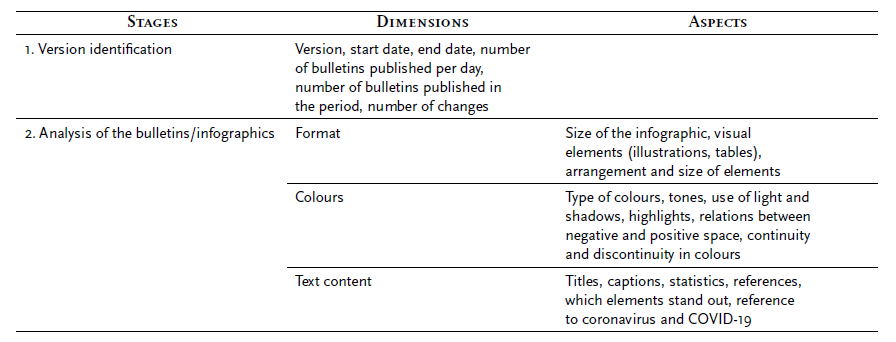
In the first stage, each infographic was analysed individually. Then, within each version, the material was analysed, focusing on the period and frequency of publication, the format, the colours and the written content. In each of these dimensions, several aspects were observed, as shown in the table below (Table 1), while keeping in mind that within infographics, these dimensions are closely articulated, and the three versions are a continuum.
4. Findings and Discussion
In the typology proposed by Siricharoen and Siricharoen (2015), the infographic created by the municipality of Rio Claro is of the data visualisation type. The authors note that functionality should be prioritised. In other words, the creators should consider the main structure, accuracy, reliability and thoroughness according to the objectives of the message they want to convey and then consider the aesthetic aspects. However, readers are expected to be attracted by the content. The infographics were also changing, probably due to the dynamic and continuously changing pandemic scenario and the urgency to communicate the municipality’s epidemiological data. We identified three main versions in the analysed period. This trial and error process demonstrates the constant effort to improve the visualisation of the data made available to the population.
In this text, we analyse each version (Version 1, 2 and 3) and discuss the formats, contents and colours. There were minor changes to include/exclude information within each version over time.
4.1. Version 1
In the first layout (Figure 1), the format is square and not completely suitable for mobile phone screens, which are mostly rectangular. In other words, it does not use all the space on these devices’ screens. According to Lupton and Phillips (1983/2008), the grid is a type of internal organisation of the layout, dividing the space between vertical and horizontal lines to help in the construction and alignment of the elements against each other, depending on the project and the designer’s choice, but it can also be circular, angular and even irregular. The grid is a way to “arrange images and organise information” (Lupton & Phillips, 1983/2008, p. 175) by occupying empty spaces and making the whole set have rhythm and scale, helping to compose the image as a whole all. In the case of the analysed infographics, it is possible to notice that horizontal and vertical lines were used, demarcating the space as a whole.
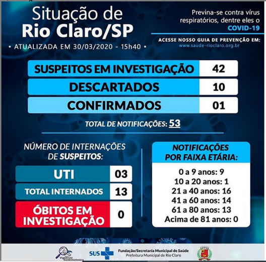
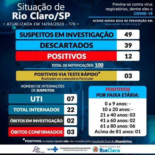
Source. From Situação de Rio Claro atualizada via informação da Vigilância Epidemiológica em 30.03.2020, 15h40 [Photograph], by Fundação Municipal de Saúde [@fmsrioclaro], 2020a, Instagram. (https://www.instagram.com/p/B-XtkJ0H0P5/)
Figure 1 First published infographic (March 30, 2020)
The infographic has many straight lines and two distinct main layers. The background glimpses parts of a stylised coronavirus as a watermark in lighter blue. With a larger font and white at the top, the second layer spells the bulletin’s name (“Situação de Rio Claro/SP”; Situation of Rio Claro/SP). The virus watermark is the only illustration in the infographic, which opts for geometric figures, especially rectangles, to break up the information, almost as if they were modules. For example, the module on suspects and reported cases; the module on hospitalisations; finally, the module on reported cases per age group, creating a relationship between them, the first module centred and above and the other two below, establish a reading flow. The colours of these information blocks, mostly blue, ultimately highlight only one module, the red one, referring to the item “deaths under investigation”. This highlight is mainly due to the use of primary colours. According to the colour circle theory (Heller, 2000/2013), the use of primary colours and their opposite colours - in this case, the predominance of blue with a red point -, generates the feeling of contrast. The use of primary colours (blue, red and yellow) and secondary colours (green) and their shade variations, especially blue, will be maintained throughout the infographics updates.
On April 9, there is a small change: the first death in the city is reported in a red column, and deaths under investigation are in black (Figure 2). After that, the confirmed cases column also becomes red, creating a new highlight in the image.
Source. From Warning Situação de Rio Claro atualizada via informação da Vigilância Epidemiológica em *09.04.2020, 16h30* [Photograph], by Fundação Municipal de Saúde [@fmsrioclaro], 2020b, Instagram. (https://www.instagram.com/p/B-xl_L0nxbw/)
Figure 2 First change in the infographic (April 9, 2020)
We believe that the choice for red in this first pandemic wave is related to the notion of danger to which this colour refers, built from the physical concept of optical dispersion - the red colour has the longest wavelength and is one of those that do not disperse much, remaining in a range visible to humans (Halliday et al., 2003/2012). From the standpoint of physics, this feature is especially important in sending warning and danger signals when the “visibility” in the surroundings is low and hazy - by analogy, the case of COVID-19 in the first months of the pandemic.
On the other hand, neuroscientists Kuniecki et al. (2015) claim that red can engage the attention of humans in emotional contexts, increasing the capacity and speed of their motor response to an unexpected event. According to the study, this colour seems to guide attention, specifically in emotionally-valenced circumstances, with red having both negative (e.g., blood, fire, danger) and positive (sex, food) connotations. In a nutshell, on seeing the red colour, the human mind is immediately activated or alerted, effectively drawing attention, especially in conditions that demand quick responses.
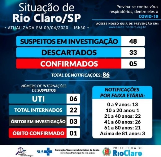
On April 11, the column of “confirmed” cases changes to “positive”, and a new column (“positive by rapid test”) is introduced, in yellow, with a note indicating tests taken in a private laboratory, information that remained until May 27. Although the tone chosen is not intense - it is not in the primary colour but has a variation, a tertiary colour - the information stands out in contrast to the predominant shades of blue, white and black. Its place in the layout (Figure 3), right in the centre of the infographic, also works as a focus point.
Source. From Warning Situação de Rio Claro atualizada via informação da Vigilância Epidemiológica em 11.04.2020, 17h. *Os casos POSITIVOS VIA TESTE RÁPIDO (Laboratório Particular) não são considerados resultados finais de diagnóstico* [Photograph], by Fundação Municipal de Saúde [@fmsrioclaro], 2020c, Instagram. (https://www.instagram.com/p/B-2rG8unplh/)
Figure 3 Second change in the infographic (April 11, 2020)
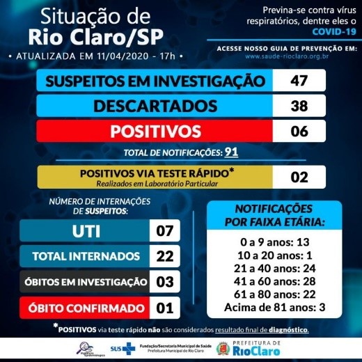
On April 14, another small change is introduced: the column which previously indicated reported cases by age is now called “positive by age group”. In this change, red is used in a third column to show the confirmed cases by age group. Thus, in this version, all information related to case confirmations and deaths is red (positive, confirmed deaths, and positive by age group; Figure 4). Considering the fear that SARS-CoV-2 infection raised, the infographic’s intention seems to be to warn of the risk of contracting the disease and falling victim to a fatal outcome.
Source. From Warning Situação de Rio Claro atualizada via informação da Vigilância Epidemiológica em 14.04.2020, 17h [Photograph], by Fundação Municipal de Saúde [@ fmsrioclaro], 2020d, Instagram. (https://www.instagram.com/p/B--dA03HAIV/)
Figure 4 Third change in the infographic (April 14, 2020)
It is important to note that between March 30 and the end of April, the publication of more than one bulletin per day was common, with up to three daily issues on March 30 and 31 and on April 4, 5, 6, 7, 12, and 29. Analysing these additional issues, we see an effort to update new cases or deaths based on the municipal health surveillance notification system. From May on, the bulletin is released once a day, usually in the late afternoon, between 4 and 6 pm. Throughout the analysed period, the bulletin was not published only on May 3 and 9.
The health crisis caused by COVID-19 was unprecedented, and much was learned as the pandemic evolved. The changes included in this first version suggest that some contents that had not been initially foreseen were added, indicating the team’s flexibility to add new information that showed the management actions and what was happening in the municipality at each moment. Including the time of day in which the bulletin was published seems to demonstrate that the numbers should be read considering the hours and minutes since the situation could change quickly.
4.2. Version 2
On May 7, the infographic’s layout changes significantly. The square format remains, but the tone is brighter and lighter (Figure 5). A lighter, brighter blue replaces the dark blue of the background. A new layer was added, framing blocks of initial information, although the original layout remains similar. The information is now displayed in a single block with a white background. This new layer is also highlighted by a combination of shadow and movement, adding depth to the image. The relationship between the areas of the infographic, although now in other tones and with greater prominence (the white background), follows the same previous flow - a larger module centred on top and two smaller blocks below.
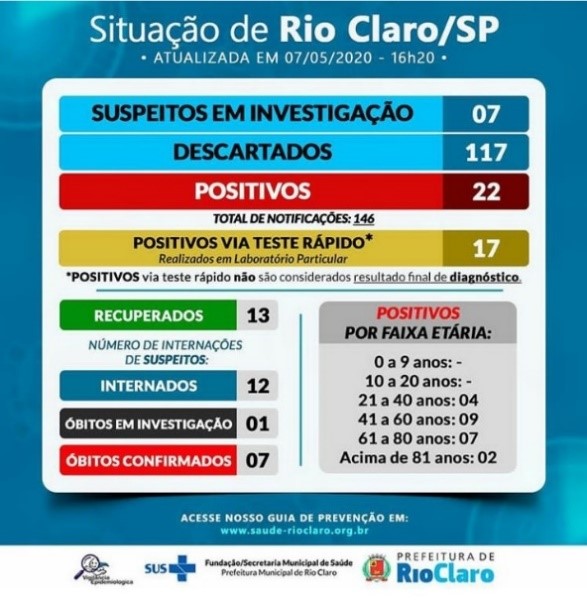
Source. From Warning Situação de Rio Claro atualizada via informação da Vigilância Epidemiológica em 07.05.2020, 16h20. Deste total de internados, 05 estão em UTI [Photograph], by Fundação Municipal de Saúde [@fmsrioclaro], 2020e, Instagram. (https://www.instagram.com/p/B_5o6rknLwj/)
Figure 5 New infographic template (May 7, 2020)
In this version, there is an attempt to make the infographic cleaner and more objective. The only direct reference to the coronavirus in the previous version, the sentence “protect yourself against respiratory viruses, including COVID-19”, is removed. That may suggest that the people who prepared the infographic believed the disease was already naturalised and the public knew the numbers referred to COVID-19.
New colours are added to the block: green and two shades of grey. The colour green has gained prominence, often displayed to present information quickly. In the case under analysis, the column in green presents the number of recovered cases, a controversial piece of data from the epidemiological point of view since, in practical terms, it does not broaden the reading on the evolution of an epidemic event. However, since the beginning of the health crisis, it has been used by different institutions, including the academicscientific. The use of green for this information aimed to speed up the process of assimilation of an “encouraging” message amid pandemic chaos, in other words, that the dreaded disease had many more cured than dead. The grey is used as a background for the interfaces, thus minimising the contrast between the darker and lighter colours of the image, reducing visual fatigue when moving from one to the other (Farina et al., 2006).
On May 27, 2020, the column “positive rapid test” is excluded, and the positives are now counted indistinctly, still in red. In this version, without this previously mentioned item, yellow is removed from the colour palette, which now remains in shades of blue, red, green and grey, besides white and the font in black and white (Figure 6).
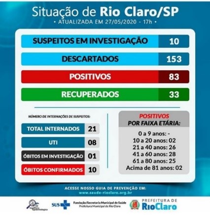
Source. From Warning Situação de Rio Claro atualizada via informação da Vigilância Epidemiológica em 27.05.2030, 17h [Photograph], by Fundação Municipal de Saúde [@ fmsrioclaro], 2020f, Instagram. (https://www.instagram.com/p/CAtJXRuHaP3/)
Figure 6 First change in the infographic’s second version (May 27, 2020)
On June 22, the information includes the total number of people admitted to wards and intensive care units (ICU), divided into public and private institutions. Here, the layout of the elements, now with added information, is more “squeezed”, with less space between the margins of each line. In this new division, different intensities of the same colour are again used to highlight information in the same “block”. The “total inpatients” item is shown in medium blue, followed by the “public” and “private” items in a lighter shade of blue. The “ICU” column follows these in a darker blue, and the items “public” and “private” in a lighter shade of blue than the previous one but more saturated than those of the inpatient item (Figure 7). Making a visual column in a gradient - first, the lightest block (admissions) followed by the darkest block (ICU) - trying to highlight also the seriousness of beds occupation, since an ICU admission bed demands more care than a clinical admission bed, thus having a certain gradation of intensity and severity of admissions.
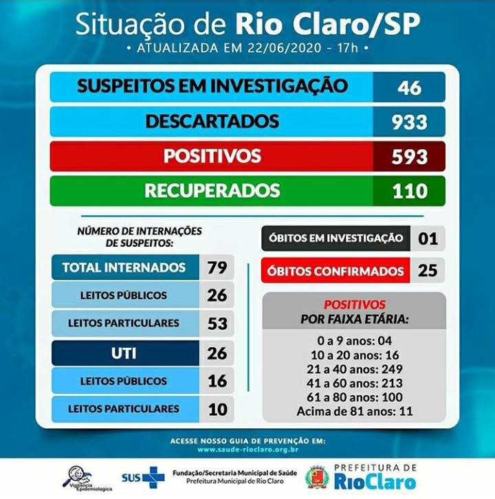
Source. From Warning Situação de Rio Claro atualizada via informação da Vigilância Epidemiológica em 22.06.20, 17h [Photograph], by Fundação Municipal de Saúde [@ fmsrioclaro], 2020g, Instagram. (https://www.instagram.com/p/CBwK6jmH6o4/)
Figure 7 Second change in the infographic’s second version (June 22, 2020)
The analysis of the content included in the infographics up to that point shows they were still changing as the pandemic evolved in the municipality. Hence, information that no longer made sense in that context was excluded. For example, given the expansion of rapid tests in the public system4, displaying the number of positive cases obtained through this method in private laboratories no longer made sense.
The block’s title “number of suspects hospitalised” may confuse the reader since it reads the number of people hospitalised, including in the ICU. That is, they are not “simple” suspected cases. Perhaps they did not have their diagnosis laboratory confirmed (the context of that time was the challenge of laboratory diagnosis, although all people with symptoms were considered to have COVID-19). However, this number refers to admission, that is, to people with aggravated disease symptoms and requiring hospital care (clinical or intensive care). Therefore, considering them as “suspects” does not explain what is being reported.
Within this block, information on the occupation of public and private beds was included because, as the number of patients increased (as shown by the number of inpatients), it became necessary to inform the situation of the health network as a whole.
4.3. Version 3
On July 2, the infographic’s layout has a third major change. The format is now rectangular and more suitable for mobile phone screens. This new version is different from the previous layout. It changes the scheme of internal organisation and the relationship between the different areas of the infographic. Instead of a block condensing all the information with more defined internal lines, the new design introduces a new division in the internal patterns (even though it is divided into blocks). The new arrangement is a larger, centred block covering two-thirds, a highlighted horizontal strip at the bottom corner of this block, and a smaller, centred module at the bottom of the infographic.
The use of the same colours recalls the previous template, but the organisation of the internal elements changes to a larger upper block, subdivided into two, the one on the left showing a very objective and direct flowchart, in which the number of positive cases covers a large column in red, unfolding into a flowchart: blue for cases receiving treatment; green for recovered cases; and black for deaths.
The right side comprises blocks of information referring to hospitalisation or home isolation. However, this side has much information, arranged and organised, perhaps seeking a “ranking” of intensity: green for cases in home isolation and different shades of blue for hospitalised cases. However, this “order” is broken because the ward is in a darker shade than the ICU, and this gradation seems broken. Also, within each module (ward and ICU), there is another colour gradation, though here to highlight and differentiate the public beds from the private ones. Maybe an alternative here would be grading the ward beds in the lightest colour, without any difference in colours, but keeping the module and the ICU block in the darkest colour, which could convey the idea of intensity more clearly, as in Version 2 (Figure 7).
Although still not making explicit textual reference to COVID-19, in this layout, it is possible to observe the comeback of a three-dimensional image of the virus as a watermark in the lower right corner and several viruses in the background of the title (“Situação de Rio Claro/SP), in the upper margin of the infographic. This template (Figure 8) remained in use until July 31, when we concluded the research.
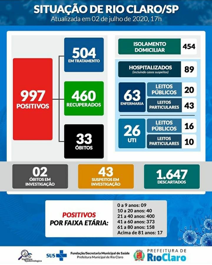
Source. From Warning Situação de Rio Claro atualizada via informação da Vigilância Epidemiológica em 02.07.20, 17h [Photograph], by Fundação Municipal de Saúde [@ fmsrioclaro], 2020h, Instagram. (https://www.instagram.com/p/CCJ3GibHiQd/)
Figure 8 Infographic published from July 2, 2020
There is a shift in the use of colour tones; the design resumes the “flatter” image of Version 1, without any combination of light and shade, using only superimposition - especially the grey band with the items “deaths under investigation”, “suspects under investigation” and “discarded”. New colours are now used compared to the previous versions. Yellow returns, but still in a tertiary tone, representing the item “suspects under investigation”. Besides the light green (highlighted), there is another shade of green, a bluish green or blue-green (tertiary tone), making the predominant shades remain blue.
Interestingly, this version, published 65 days after the first infographic, is more objective and synthetic than previous ones. A good example is the exclusion of the designation “confirmed deaths”, which at that time already totalled 33 and is now presented only as “deaths”. The same occurs with the number of admissions: they are presented as more organised, and the title informs that it is about overall hospitalisations, including suspected cases.
As we showed throughout the analysis, the layout and content of the infographics changed according to the need to exclude or include new information. The team responsible for this dissemination was apparently testing the models over time, according to the demands imposed by the succession of events and the uncertainties typical of extreme health events, such as the pandemic of COVID-19. This last design, launched on July 2, seems to have been the most consistent, not having undergone any changes until the end of our analysis on July 31.
One aspect that drew our attention was that in all versions, the infographics sought to display the number of positive and/or reported cases by age group. It seems there was an interest in alerting the population to the spread of the disease in different population groups. Furthermore, it implicitly pointed to the need for specific prevention measures for these groups.
As for the use of colours, the infographics seem to have followed basic design aspects. For Kress and Van Leeuwen (2006), colours are a materiality that has several uses and produces many meanings and effects. They do not have “fixed functions”, and their meanings change according to sociability and culture. It was possible to observe in the infographics that the solid colours highlighted the information according to the nature of the different and concurrent events arising from the epidemic: red to highlight the positive cases and confirmed deaths; yellow, first, for positive cases via rapid test and, then, suspected cases; and green, for recovered cases. This choice seems to allude to the traffic lights’ colours, danger/stop, attention and go ahead. It is worth noting that blue, in its various shades, remained in the three designs. Widely used in official communication of the municipality, the colour refers to the slogan of Rio Claro, “blue city”.
The texts play a key role in using graphic resources for data visualisation since they complement each other (Unwin, 2020). For the infographic used to convey to the population information about COVID-19 in the municipality of Rio Claro, some aspects seem critical to us and need to be discussed, as they hinder the understanding and/or confuse the reader. Namely the title, the use of some words such as “suspects” and “investigation”, which appear in all versions, sometimes more than once, and the number of hospitalisations.
The choice of the title “Situação de Rio Claro”, which despite all the changes in the layout remained over time, always without explicit reference to COVID-19, does not meet the function of informing clearly and objectively what the infographics are about. The word “situation” is used in the dictionary sense as: “a condition or combination of conditions that exist at a particular time; conjuncture” (Houaiss, 2001, p. 2587). The definition alone indicates, therefore, that it would be necessary to inform to which event the word was referring. One possibility that could explain the absence of a title is that in some bulletins, the background watermark of Sars-CoV-2 (an image widely used in the material of the Ministry of Health and made popular by the mainstream media in Brazil) would be used to inform on its own that it was the COVID-19 pandemic. However, this assumption does not hold because it was not kept in all layouts and was lost in the overlapping colours and information. Thus, despite making it explicit that they were official data, since all infographics displayed the logos of the Unified Health System, the Municipal Health Foundation and the city of Rio Claro, to broaden the understanding and scope of the image, the title should explain that the infographic was about the situation of COVID-19 in the city.
Although the infographics were designed to inform the general population, the language used remained too attached to epidemiology and health jargon. Clearly, in the information on reported cases, they excluded the word “reported” in the first update of Version
2. That is an important change because “reported” is not a familiar repertoire for most of the population. However, they did not make this effort with other terms such as “suspects” and “investigation”. These two terms are directly associated with crime and the notion that something is wrong and hidden, requiring detective work to uncover. Thus, having been used in infographics that sought to inform the general population, Finset et al. (2020), discussing effective health communication during the COVID-19 pandemic, state: “it is important to provide information in lay language that is clear, specific, unambiguous and consistent” (p. 874). Furthermore, it is important to consider the discussion presented by Oxman et al. (2022) about the communication of public agencies, in which they point out that it needs to be transparent and trustworthy, which also avoids “victim-blaming” by using terms or threats that contribute to the stigmatisation of people with certain pathologies.
Using absolute numbers seems helpful for most aspects the infographics wanted to inform. However, in the case of admissions, the total numbers or divided into people admitted to the ICU and in wards and public and private beds was information of little practical use since it did not give the number of beds available in the municipality, making it impossible to identify the actual bed occupancy rate.
5. Final Considerations
In epidemic events, statistical data on the spread of a virus is essential to measure the evolution of a disease and the deaths it can cause. In the COVID-19 pandemic, it was no different, and the numbers played a central role in the global and local public agenda. As this is a problem shared by most countries, these data support the study and understanding of the pandemic, allowing international organisations like the World Health Organization to demand transparency from national governments in data collection and dissemination methods. Furthermore, in the current pandemic, there is no doubt that the population’s understanding of the number of cases and the evolution of the pandemic can increase their adherence to public strategies to control the disease. In Brazil, this perspective has prompted many municipal managers to invest in the transparent dissemination of the COVID-19 numbers, of which the epidemiological bulletins analysed in this article are an example.
The Rio Claro infographics were developed and improved over time to be easily viewed on mobile phones - the design, size and distribution of information considered the shape of these screens. This option is consistent with an important characteristic of this technology in Brazil: according to research (Maioria dos Brasileiros Acessa Internet Apenas Pelo Celular, 2022), mobile phones are the devices most used by Brazilians to access social networks. Thus, the decision to inform the population through infographics disseminated through social networks such as Instagram was a wise decision that gave a great number of people access to information about the pandemic quickly and easily. Nevertheless, the degree of uncertainty regarding COVID-19 and the need to provide quick answers to society’s demands for information led Rio Claro to adopt a trial-anderror strategy and test different infographic templates in real-time. In this sense, we hope that this work and other studies on infographics for communicating epidemiological data can contribute to a reflection on the design choices when it comes to communicating health data in a health crisis and that in future crises, such a long process is not necessary to produce a final infographic format.
Hence, the knowledge acquired on design and health communication during the COVID-19 pandemic is expected to be assimilated by the management teams so that in future health crises, communication will be based on the guidelines recommended by the World Health Organization. The importance of information design in the health communication process should also be acknowledged.
REFERENCES
Baldapan, P. B. T., & Talde, D. K. J. C. (2022). A multimodal discourse analysis of Philippine Resbakuna infographics. Education Mind, 1(1), 58-73. https://doi.org/10.58583/Pedapub.EM2205 [ Links ]
Bursi-Amba, A., Gaullier, A., & Santidrian, M. (2016). Infographics: A toolbox for technical writers? Diderot University. [ Links ]
Cairo, A. (2011). El arte funcional: Infografía y visualización de información. Alamut. [ Links ]
Duarte, A. de M., & César, M. R. de A. (2021). Denial of politics and denialism as a policy: Pandemic and democracy. Educação & Realidade, 45(4), e109146. https://doi.org/10.1590/2175-6236109146 [ Links ]
EPTV1. (2020, 9 de junho). Rio Claro inicia testes rápidos de Covid-19 em pessoas com idades entre 15 e 59 anos. G1. https://g1.globo.com/sp/sao-carlos-regiao/noticia/2020/06/09/rio-claro-inicia-testes-rapidos-decovid-19-em-pessoas-com-idades-entre-15-e-59-anos.ghtml [ Links ]
Escobar, B. T. de, & Spinillo, C. G. (2016). Retórica visual na infografia sobre saúde | Visual rhetoric in health infographics. InfoDesign - Revista Brasileira de Design da Informação, 13(2), Artigo 2. https://doi.org/10.51358/id.v13i2.471 [ Links ]
Farina, M., Perez, C., & Bastos, D. (2006). Psicodinâmica das cores em comunicação (5.ª ed.). Editora Edgar Blücher. [ Links ]
Finset, A., Bosworth, H., Butow, P., Gulbrandsen, P., Hulsman, R. L., Pieterse, A. H., Street, R., Tschoetschel, R., & van Weert, J. (2020). Effective health communication - A key factor in fighting the COVID-19 pandemic. Patient Education and Counseling, 103(5), 873-876. https://doi.org/10.1016/j.pec.2020.03.027 [ Links ]
Fundação Municipal de Saúde [@fmsrioclaro]. (2020a, 30 de março). Situação de Rio Claro atualizada via informação da Vigilância Epidemiológica em 30.03.2020, 15h40 [Fotografia]. Instagram. https://www.instagram.com/p/B-XtkJ0H0P5/ [ Links ]
Fundação Municipal de Saúde [@fmsrioclaro]. (2020b, 9 de abril). Alerta Situação de Rio Claro atualizada via informação da Vigilância Epidemiológica em *09.04.2020, 16h30* [Fotografia]. Instagram. https://www.instagram.com/p/B-xl_L0nxbw/ [ Links ]
Fundação Municipal de Saúde [@fmsrioclaro]. (2020c, 11 de abril). Alerta Situação de Rio Claro atualizada via informação da Vigilância Epidemiológica em 11.04.2020, 17h. *Os casos POSITIVOS VIA TESTE RÁPIDO (Laboratório Particular) não são considerados resultados finais de diagnóstico* [Fotografia]. Instagram. https://www.instagram.com/p/B-2rG8unplh/ [ Links ]
Fundação Municipal de Saúde [@fmsrioclaro]. (2020d, 14 de abril). Alerta Situação de Rio Claro atualizada via informação da Vigilância Epidemiológica em 14.04.2020, 17h [Fotografia]. Instagram. https://www.instagram.com/p/B--dA03HAIV/ [ Links ]
Fundação Municipal de Saúde [@fmsrioclaro]. (2020e, 7 de maio). Alerta Situação de Rio Claro atualizada via informação da Vigilância Epidemiológica em 07.05.2020, 16h20. Deste total de internados, 05 estão em UTI [Fotografia]. Instagram. https://www.instagram.com/p/B_5o6rknLwj/ [ Links ]
Fundação Municipal de Saúde [@fmsrioclaro]. (2020f, 27 de maio). Alerta Situação de Rio Claro atualizada via informação da Vigilância Epidemiológica em 27.05.2030, 17h [Fotografia]. Instagram. https://www.instagram.com/p/CAtJXRuHaP3/ [ Links ]
Fundação Municipal de Saúde [@fmsrioclaro]. (2020g, 22 de junho). Alerta Situação de Rio Claro atualizada via informação da Vigilância Epidemiológica em 22.06.20, 17h [Fotografia]. Instagram. https://www.instagram.com/p/CBwK6jmH6o4/ [ Links ]
Fundação Municipal de Saúde [@fmsrioclaro]. (2020g, 2 de julho). Alerta Situação de Rio Claro atualizada via informação da Vigilância Epidemiológica em 02.07.20, 17h [Fotografia]. Instagram. https://www.instagram.com/p/CCJ3GibHiQd/ [ Links ]
Halliday, D., Resnick, R., & Walker, J. (2012). Fundamentos de física: Volume 4 - Óptica e física moderna (R. S. de Biasi, Trad.). Livros Técnicos e Científicos Editora. (Trabalho original publicado em 2003) [ Links ]
Heller, E. (2013). A psicologia das cores: Como as cores afetam a razão e a emoção (L. L. da Silva, Trad.; 1.ª ed.). Gustavo Gili. (Trabalho original publicado em 2000) [ Links ]
Houaiss, A. (2001). Dicionário Houaiss da língua portuguesa. Editora Objetiva. [ Links ]
Instituto Brasileiro de Geografia e Estatística. (2012). Censo 2010. https://censo2010.ibge.gov.br/ [ Links ]
Jiménez-Barreto, J., Loureiro, S., Braun, E., Sthapit, E., & Zenker, S. (2021). Use numbers not words! Communicating hotels’ cleaning programs for COVID-19 from the brand perspective. International Journal of Hospitality Management, 94, Artigo 102872. https://doi.org/10.1016/j.ijhm.2021.102872 [ Links ]
Kress, G., & Van Leeuwen, T. (2006). Reading images: The grammar of visual design. Routledge. [ Links ]
Kuniecki, M., Pilarczyk, J., & Wichary, S. (2015). The color red attracts attention in an emotional context. An ERP study. Frontiers in Human Neuroscience, 9, Artigo 212. https://doi.org/10.3389/fnhum.2015.00212 [ Links ]
Lima, R. O. da C. (2015). O que é infografia jornalística? InfoDesign - Revista Brasileira de Design da Informação, 12(1), Artigo 1. https://doi.org/10.51358/id.v12i1.312 [ Links ]
Lopes, F., Araújo, R., & Magalhães, O. (2021). COVID-19: Uma pandemia gerida pelas fontes oficiais através de uma comunicação política. Comunicação e Sociedade, 40, 17-32. https://doi.org/10.17231/comsoc.40(2021).3520 [ Links ]
Lundgren, R. E., & McMakin, A. H. (Eds.). (2004). Risk communication: A handbook for communicating environmental, safety, and health risks (3.ª ed.). Battelle Press. [ Links ]
Lupton, E., & Phillips, J. (2008). Novos fundamentos do design (C. Borges, Trad.). Cosac & Naify. (Trabalho original publicado em 1983) [ Links ]
Maioria dos brasileiros acessa internet apenas pelo celular. (2022, 21 de junho). Itforum. https://itforum.com.br/noticias/maioria-dos-brasileiros-acessa-internet-apenas-pelo-celular/#:~:text=O%20dispositivo%20celular%20se%20mant%C3%A9m,ter%C3%A7a%2Dfeira%20 [ Links ]
Malinverni, C., & Brigagão, J. I. M. (2020). COVID-19: Scientific arguments, denialism, eugenics, and the construction of the antisocial distancing discourse in Brazil. Frontiers in Communication, 5, Artigo 582963. https://doi.org/10.3389/fcomm.2020.582963 [ Links ]
McCrorie, A., Donnelly, C., & McGlade, K. (2016). Infographics: Healthcare communication for the digital age. The Ulster Medical Journal, 85(2), 71-75. [ Links ]
Muñoz, N., & Lucas-Barcia, E. (2022). Evaluación de infográficos durante el primer año de pandemia en ‘El País Digital’ (2020-2021). index.comunicación, 12(1), 177-204. https://doi.org/10.33732/ixc/12/01Evalua [ Links ]
Oxman, A. D., Fretheim, A., Lewin, S., Flottorp, S., Glenton, C., Helleve, A., Vestrheim, D. F., Iversen, B. G., & Rosenbaum, S. E. (2022). Health communication in and out of public health emergencies: To persuade or to inform? Health Research Policy and Systems, 20(1), Artigo 28(2022). https://doi.org/10.1186/s12961-022-00828-z [ Links ]
Pan American Health Organization. (2018). Risk and outbreak communication. https://www.paho.org/en/topics/risk-and-outbreak-communication [ Links ]
Ricard, J., & Medeiros, J. (2020, 17 de abril). Using misinformation as a political weapon: COVID-19 and Bolsonaro in Brazil. Harvard Kennedy School Misinformation Review. https://doi.org/10.37016/mr-2020-013 [ Links ]
Roberts, L. (2020, 2 de abril). What role does design play in a public health crisis? Eye on Design. https://eyeondesign.aiga.org/what-role-does-design-play-in-a-public-health-crisis/#:~:text=Whether%20employed%20to%20warn%20or,saving%20messages%20accessible%20to%20all [ Links ]
Santos, M. O. S. dos, Peixinho, B. C., Cavalcanti, A. M. C., Silva, L. G. F. da, Silva, L. I. M. da, Lins, D. O. A., & Gurgel, A. do M. (2021). Estratégias de comunicação adotadas pela gestão do Sistema Único de Saúde durante a pandemia de COVID-19 - Brasil. Interface - Comunicação, Saúde, Educação, 25(1), e200785. https://doi.org/10.1590/interface.200785 [ Links ]
Siricharoen, W. V., & Siricharoen, N. (2015, 12-15 de maio). How Infographic should be evaluated? [Apresentação de comunicação]. The 7th International Conference on Information Technology, Universidade de AL-Zaytoonah, Amã, Jordânia. https://doi.org/10.15849/icit.2015.0100 [ Links ]
Siricharoen, W.V., & Siricharoen, N. (2018). Infographic utility in accelerating better health communication. Mobile Networks and Applications, 23, 57-67. https://doi.org/10.1007/s11036-017-0900-3 [ Links ]
Sutton, J., Renshaw, S. L., & Butts, C. T. (2020). COVID-19: Retransmission of official communications in an emerging pandemic. PLOS ONE, 15(9), e0238491. https://doi.org/10.1371/journal.pone.0238491 [ Links ]
Unwin, A. (2020). Why is data visualization important? What is important in data visualization? Harvard Data Science Review, (2.1), 1-7. https://doi.org/10.1162/99608f92.8ae4d525 [ Links ]
1Rio Claro is a municipality in the interior of the state of São Paulo which, according to the 2010 census of the Brazilian Institute of Geography and Statistics (Instituto Brasileiro de Geografia e Estatística, 2012), has 186,253 inhabitants.
2On June 9, the municipality of Rio Claro was reported to have expanded the number of rapid test sites in the public network (EPTV1, 2020).
Received: November 11, 2022; Accepted: February 20, 2023
 Este é um artigo publicado em acesso aberto sob uma licença Creative Commons
